RETHINKING HOW MARKETING STUDIES ARE PRESENTED
Competition is particularly strong in the research market, especially in France. In recent years, there has been a genuine digital upheaval, with competition arising from pure players, which operate exclusively online. As a result, they have acquired sound expertise in processing web data; Google, Facebook, Twitter…
Looking at studies provided by the ten largest research institutes, it becomes clear that more and more of them are using online data to enrich their quantitative and qualitative surveys. Much of their information comes from social networks, as well as web-browsing habits.
Analytical processing and data visualization tools can partially automate this qualitative analysis process by aggregating and rendering the data as simply and clearly as possible. The goal is also to reduce costs for both research companies and their customers.
Disruption in the research market is also linked to an ongoing transition from the world of statistics to a more advisory role, where figures are no longer sufficient unto themselves. Nowadays, customers seek actionable information. The data provided must be sufficiently processed and understood to draw conclusions.
For instance, a company operating on the French football market that is able to quickly understand the motivations for purchasing football jerseys can implement a new marketing strategy.
BIG DATA, AN OPPORTUNITY WORTH SEIZING FOR RESEARCH COMPANIES
Research institutes and polling firms’ added value no longer lies in the collection of data per se, but in the expertise, they can draw from that data. The challenge for these companies is to offer a relevant analysis by presenting their results in such a way that customers can derive directly actionable initiatives.
Today, market research is partly based on a rich collection of data. Once all this data is available, it is very difficult to extract its full potential. Conducting market study often leads to mountains of data that can impact subsequent operational actions.
Opportunities are great and will have to be focused both on sector-specific and business expertise, as well as on conveying understandable information through impactful communication. PowerPoint deliverables and Excel reports are no longer the best way to present research work.
Today’s customers need interactivity. They want to access data easily without getting lost in dense and raw files. The ultimate goal is to have a clear overview of the market’s evolution, potential, and maturity.
Promising development prospects
The research institute sector is undergoing profound changes. In France, the opinion-survey segment still represents nearly 50% of its business.
What is interesting, however, is the other half. They carry out marketing studies on behalf of large companies’ marketing departments. More and more companies are choosing to handle these activities in-house, through their research and marketing departments, and by recruiting analysts.
Therefore the goal of research institutes is to provide a new approach to the data collected. Their business is evolving due to new technologies and digital tools at their disposal, such as the emergence of social media, which helps them collect large amounts of data on consumers’ habits, impressions, and opinions about products and brands.
In 2016, Nielsen reached an agreement with Facebook in the United States to set up a monitoring system for users’ audio-visual programs. So institutes must rethink their strategy by integrating strategic partners, with genuine expertise on digital issues.
Data visualization for marketing research
Let’s start with a basic definition. Data visualization helps communicate raw figures by transforming them into visual information: bars, graphs or maps. Overall, data visualization is a very powerful communication tool, since it offers significant time-saving in terms of data analysis.
“Data visualization is the art of telling numbers in a creative and playful way, precisely where Excel tables fail. It’s like putting statistical information to music”
Charles Miglietti, co-founder of Toucan Toco
Let’s take a concrete example to illustrate our point. You want to analyze the number of visits to some European countries. In the table below, you have all the data at your disposal. But can you quickly identify a trend by country over the last 5 years?
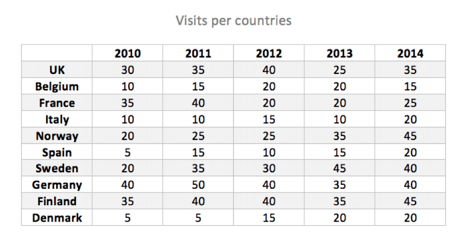
Now let’s take the same data, and transpose it on a map, using a color scale. Isn’t the information clearer now?

Our brain loves visual content. 80% of the information we collect on a daily basis is dedicated to image processing. The same applies to business. Just imagine the power of such a tool on strategic and actionable data. Understanding them quickly means being able to make the right decisions at the right time.
Research and survey institutes can use data visualization to transition from simply collecting data to aggregating multi-channel data, and offering clear, readable, and sustainable information over time.
Data visualization, a decision-making tool
Companies’ approach is now digital. All of them are gradually investing in digital tools, whatever the industry and company’s department. Using data-visualization tools to report the results of ad hoc studies can help businesses differ from competitors.
It is also a great way to historize data! For an annually commissioned survey, the provider will probably use a new Excel and PowerPoint file every year. Difficult in this case to make data connections over time.
That’s why it is necessary to capitalize on this data so that every survey can be reused. Data-visualization solutions now exist and can help businesses work on the same basis so that they rely on a data history to achieve a more precise and relevant analysis.
Telling a story, the new goal for research institutes
As we saw, data visualization makes it easy to understand and navigate from one piece of information to the next. When a research institute presents its deliverable, the goal is to go beyond simple restitution of data. They should strive to share their knowledge on any given subject.
Every data carries a specific message. That’s why it’s important to remain fair and insightful when presenting your results, especially when your audience is not an expert in the subject at hand. Telling a story will help you make data accessible and easily understandable.
Therefore the challenge is to communicate market information to the management team in a relevant way. In this regard, data visualization tools available on mobile are particularly useful. Nowadays a C-level or marketing manager must be able to browse information on their tablet or smartphone; it has become standard practice.
Data is at the heart of the ongoing overhaul of research institutes. These businesses’ added value is no longer based on data collection, which has been significantly facilitated by new digital tools.
The relevance of research and polling firms now lies in their ability to tell a story based on data. Data must support and drive decision-making. This is why data reporting must be as clear and understandable as possible. Good news, data visualization makes it possible!
Learn more about PSA’s experience, a company that chose a data-storytelling tool to address its marketing issues.