“A picture is worth a thousand words.”
Confucius had no computer when he said this. Yet this is truer than ever with the mountains of data collected in a company. It is still complex to analyze, explain, and share in its raw form.

WHAT IS DATA VISUALIZATION OR “DATAVIZ”?
We have all spent hours analyzing data from endless, complex Excel tables.
“Dataviz” puts an end to this tedious task. Simply put, it allows you to communicate numbers or raw information by transforming them into visual objects: dots, bars, lines, maps, etc.
It combines simplicity and design and allows you to save a significant amount of time in the research and analysis of data. It is also a powerful communication tool.
DEFINITION
“Data visualization is the art of telling numbers in a creative and fun way, where Excel tables fail. It’s a way of putting numbers to music,” explains Charles Miglietti, a data visualization expert and the co-founder of Toucan Toco
To illustrate this, here is a concrete example: how many 6s can you count?

It’ll take a while, right?
But change the color of all the 6s: much simpler!

Data visualization uses simple concepts from Gestalt theory. This is a psychology term that refers to the tendencies that human beings have to organize visual elements in groups. This makes it easier to distinguish shapes through the use of color and other visual processes.
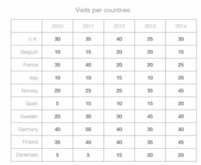
Another example: analyzing an excel file
We want to understand which countries have the highest number of visits. The following spreadsheet shows us the values for each country. But is this the easiest and quickest way to compare countries? And explain this to your audience in a few seconds?
However, if we transcribe this data on a map, playing with a color chart for the rate of visits, everything becomes clearer:
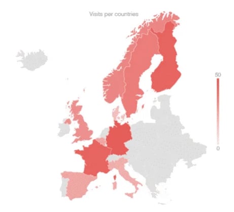
Everything is easier when the relevant data is presented ergonomically, in color, and is obvious. The brain works visually, capturing 80% of the information through pictures. From an overabundance of data, the useful information is extracted and the superfluous is eliminated.
It is easy to imagine what this might entail at the corporate level.
1.Focus on the essentials and facilitate decision making
Finding and interpreting data in a spreadsheet is often time-consuming and tedious. Dataviz can result in phenomenal time saved. Access to data becomes fast, accurate, and easily understandable.
Corporate data is often scattered across various media, making it difficult to analyze.
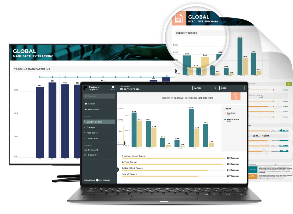
Dataviz will group it onto a single screen, organized into different relevant graphics. These indicators can be gathered on ergonomic dashboards, deployed in real-time, and this can display trends that can only be perceived visually. This will tremendously facilitate decision-making.
2.DATA VISUALISATION: IMPROVE TRANSPARENCY AND COMMUNICATION
A cross-functional advantage of dataviz is that it allows all employees to interact with the data. And this without necessarily having any technical expertise.
Departments that may have once felt excluded from accessing and understanding their company's data can now enjoy this benefit, which is a big step forward in information transparency.
Communication between the different departments is easier since once the complicated figures of the finance department are translated into impactful visuals, marketing will be able to use them more effectively.
3. DATA STORYTELLING: TELL A STORY WITH YOUR DATA
Dataviz makes it easy to navigate from one piece of information to another while processing extremely large databases. All this through interactive charts and dashboards that are expertly designed.
During a presentation, the goal is not simply to state your results. It is necessary to offer a global view of your activity. Apply a funnel analysis and understand the reasons for a specific fluctuation.
An educational effort must be made on the context to allow an audience to understand the data.
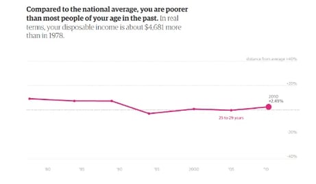
This data visualization by The Guardian represents this notion well.
We believe that purchasing power has declined since 1979. However, our salaries are higher today. The comparison is difficult to make.
This visualization provides transparency. It teaches us that in reality, the standard of living is increasing for certain age groups in France, contrary to common belief.
This is a good representation of data storytelling. It shows an evolution visually by comparing it to different countries, age categories, and years. The visualization is supported by short comments to guide the audience. It’s a powerful communication method.
Within a company, whether in HR for the evolution of the workforce or in Finance in understanding the balance sheet, all data carries a message. Each graphic must have a clear and precise message to facilitate the understanding of complex information. This is what data storytelling is all about.
4. EXAMPLES
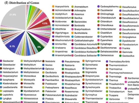
Although the graphic tools in Excel and PowerPoint are still widely used, their functionalities remain limited, and some are still poorly used. We might think of the famous pie chart, which is unreadable as soon as it represents more than 3 or 4 values.
Companies and institutions are increasingly using data visualization tools, which are often presented in the form of dashboards, with several degrees of precision. The website presenting the “Weather Report” of French Economy is a good illustration of this: http://www.meteodeleco.fr
5. DATA VISUALISATION FOR FUN
Dataviz can also be used for more entertaining purposes. It is easier to read the news in a visual, pretty form, rather than an endless article. For example, this data visualization illustrates how much truth there is in Hollywood historical films.
Beyond illustrations, we can even present data in the form of animations or even videos. The most famous of these is the Billion-Dollar-A-gram, created by David McCandless, a master of the art.
Appealing, functional, simple: data visualization is a powerful tool for democratizing access to data. It facilitates the understanding and analysis of numbers, and thus increases transparency.
This is a major challenge for companies. When it tells a story, dataviz becomes the best friend of decision-makers.