


Today, communication is fragmented in almost all companies. Financial communication for the investors, the inclusion of new accounting methods, supervision of management functions, accounting, and finance… You can get lost.
Financial reporting is crucial because it allows companies – from medium-sized ones to multinationals – to base future vision and direction on key indicators. Furthermore, the International Financial Reporting Standards (IFRS), require a general presentation of financial status in addition to changes in accounting methods.
More and more financial executives are considering an investment in unified reporting, as it has become the principal tool for informed decision-making.
Here are some key rules to know if you want to master financial reporting.
1. Understand Your users' needs
Before you start, ask yourself about:
- The nature of your company
- The industry in which it is operating
- The users' needs
If you want to be able to set up scenarios with the data you collected, which is essential to create your financial report, you have to know the context and the use case. Each company and financial function has a specific use of its data.
Focusing on different professions allows you to identify the most important data:
- Main sources of income of the company (by product, area, distribution channel…)
- Main sources of costs (the value or percentage of fixed costs, variable costs …)
- Key resources of the company
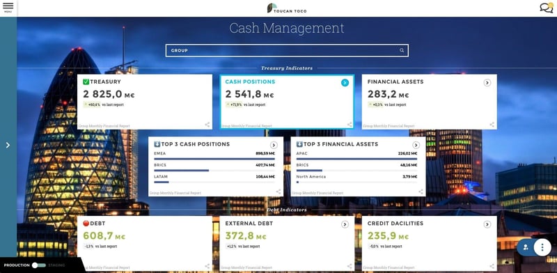
There is no fixed pattern to crafting a financial dashboard. Each department, profession, and industry has its own codes and this plurality requires a high level of personalization.
2. Don't Confuse Your Audience
When you build a financial dashboard, the main risk is drowning in a sea of data. There are many ways to avoid this:
- Focus on the information available at the moment you do the job.
- Prioritize your KPIs. There is one rule to respect: go straight to the essential. Do not forget that a dashboard has two functions: help decision-making and communication to your managers or your team. We know that it can look counter-intuitive.
Indeed, people who build reports are always nervous about missing crucial information. However, including 20 metrics can convolute insights that would otherwise be clearer to act upon with the inclusion of the 10 most important metrics.
Leonardo de Vinci said: Simplicity is the ultimate form of sophistication. A clear view allows the audience to focus on data more than on the understanding of a slideshow. The keys to a good presentation are a strong message, contextualization, and relevant data.
3. Select Relevant KPIs
What is your goal when you make financial reporting? Is it to support the management of a specific project, to provide an analytic view of the company’s activity, or just to have an overview of the main financial indicators at a precise moment?
New technologies of data visualization give the opportunity to generate graphics and interactive dashboards with entertaining designs. Dataviz enables you to browse easily from one piece of information to another while processing huge databases.
During a presentation, the goal is not just to read your results, it is to give an overview of your activity and make your audience understand the causes of a precise fluctuation. For that, you have to build things in a pedagogic way and contextualize data. It is called data storytelling.
Each KPI tells a story about the company’s activity. HR data can explain staff evolutions, financial data helps understanding statements… The thing is that each piece of data holds a message that has to be understood. Confucius said: an image is worth a thousand words. Each graphic must hold a clear message to help the understanding of complicated information.
4. Update, Update, Update

Your financial report is not an end - it is a means to an end. Consider it as a step in your decision-making process. Thus, it is absolutely necessary to update it periodically and consistently.
That will enable decision-makers to synchronize decision cycles with the release of reporting – making dashboards real piloting tools for the company’s performance.
Your environment, projects, goals, and constraints are changing. Good reporting identifies and even directs those changes. Thus, you should always make sure that your dashboard is made with indicators that correspond to your needs and that push your team to act. An indicator that triggers no action in case of sudden change is not a good one.
5. One indicator Per screen
Tired of being confused by others' dashboards? Don't replicate their mistakes.
The easier data are to read, the faster they will be understood, facilitating decision-making. Furthermore, people are not always familiar with the formats used and it is crucial to make information accessible.
A graphic must hold only one message. Dashboard creators are presenting clusters of indicators and graphics too often, confusing their audiences. It is more impactful to present an idea with one visualization on one screen, including them on distinct, concise slides. Do not overload your graphics.
You have now understood that building a financial report does not mean compressing your organization's most complex data. Building a financial dashboard means making that information comprehensible for everyone.
Pick the most relevant information and try to see them through the eyes of your audience. Your dashboard has to be meaningful without any explanation. If you can send it to your recipient without any commentary, it means that you did it well!
Baptiste Jourdan, co-founder of Toucan Toco.

.png)

.webp)