Understanding the data created by the entire organization is a major issue for all HR stakeholders. This englobes HRIS, training, social data, and CRM. Going through a digital transformation requires decision-makers to ask the right questions about the data they possess and how they want to use it.
How can you set up an effective HR dashboard? What’s the purpose in the context of HR management? We'll answer these questions in the context of data storytelling and explain how important visualizations are to gleaning insights from your data.
In this article, we will dive into new HRM concerns. We want to help you build your HR dashboard so that you become agile leaders in your company’s change management.
WHAT IS AN HR DASHBOARD?
Let’s start with the basics. According to the sub-definition of the word “table”, it’s a “set of indicators […] allowing a company to check the proper operation of its various services and to manage them.” So a dedicated HR dashboard is, in fact, a tool used to manage operations, monitoring, and team evaluation.
THE DASHBOARD AS A MANAGEMENT TOOL
What's at stake with an HR Dashboard?
This management tool is not frozen in time. It must be easily edited depending on the state of your business. To make it more agile, you must be able to aggregate new HR monitoring indicators.
You need to communicate on your social reports, rearrange your HR dashboards in real-time and identify new performance levers. These actions should help you become more effective in your decision-making and in your communication.
Therefore, companies must learn to collect and analyze their data better. But why?
To meet new business challenges, and address changes in job roles and new organizational and budgetary constraints.
HR indicators, what are we talking about?
First, we’ll go back to what a good indicator is. Then we will delve into which HR indicators we can take into account when it comes to HR strategic and operational management.
Commonly called KPI (Key Performance Indicator for) in marketing, it allows to control and measure of previously defined data.
As an example, these data can be values that are updated monthly to be compared against a target defined by your company.
Data Storytelling in HR Dashboards
Now that we've covered the basics of an HR dashboard as a management tool, it's important to understand the impact that data storytelling can have on your embedded analytics application.
HR statistics have boomed in recent years, with a focus on ESG, training, and productivity leading the charge. It is common for HR professionals to juggle all of this data and not really gain much from it. Even though their firm invests hundreds of thousands in solutions that were promised to make their lives easier, it actually makes it more difficult.
Why is that the case?
For starters, many embedded analytics solutions do not tailor their applications to non-technical users. For an application to be usable across a variety of positions and departments, it must tell a relatable story.
KPI Selection
Selecting the right indicators is the first step to an effective HR dashboard. The first step in the KPI selection process is to think of the question your dashboard will involve a question. For example, Sally, an HR director, sees that her firm's diversity is much lower than in past years. To gain insights into which KPIs relate to diversity, Sally's dashboard would answer the question "How can we increase diversity in our workforce?"
By narrowing the focus of your dashboard, you can avoid the urge to crowd your design with KPIs that will take away from the data storytelling experience.
Visual Organization
Once you select your KPIs, it's time to select the appropriate visualizations. Most commonly, designers will select bar and line graphs, which are the most popular. The same rule from KPI selection applies to visualizations - less is more.
Let's paint a picture to give a clearer example. You select your 4-6 KPIs, 3 of which display written data and take up about a third of the space available. You are told by your designer that the rest of the space can be taken up by data visualizations. You may be tempted to fill every millimeter of space available, thinking that you'll extract more from your dashboard and get your money's worth.
This may sound counterintuitive, but that approach will not generate a desirable outcome. Instead of clear insights into the essential KPIs that answer your question, the sheer number of visualizations directs your attention to a million others. This distracts from your story and will inevitably confuse your end user.
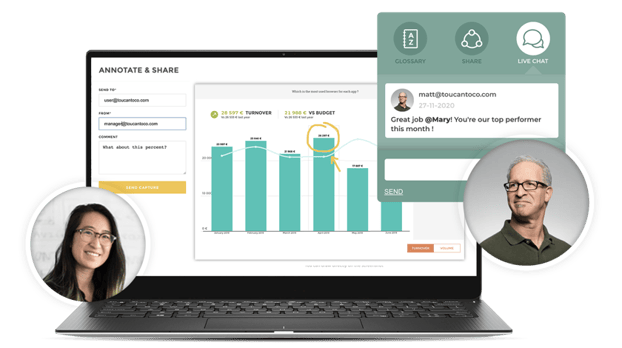
Collaboration and Navigation
Although your dashboard itself is the centerpiece of your story, the experience around it can greatly impact the story's delivery. For example, if the navigation and UI of an embedded solution are buggy and glitchy, you can't even open the cover of your book.
Book clubs have emerged as a popular forum for ideas to discuss stories and their interpretations. We believe that an embedded analytics tool should replicate aspects of book clubs to collaborate and discuss the story's details.
Let's take Toucan's features as an example. With simple navigation, comment sections, a glossary for non-technical users, and the ability to annotate, teams can meet in seconds to discuss insights with one click or tap.
HOW CAN YOUR HR DASHBOARD HELP YOU COMMUNICATE?
Digitalising HR Reporting
Over 50% of a company’s operating costs are dedicated to employees. This is why HR departments need to be equipped with efficient dashboards. These HR reporting tools allow following daily operations accurately.
Automated data management and focus on analysis and decision-making is no longer a dream, it is real. And if it hasn’t reached your company already, it should! Whether you are a Human Resources Director or Manager, you’re not supposed to spend your time managing Excel files (and you know what we think about using Excel to do your reporting…).
Your goal is to analyze and understand what is or is not working within your company. Why is your turnover up? Why is absenteeism up in X department?
What’s your team's progress like? These are the questions you need to ask yourself to build your HR dashboard.
Your Reporting is a Communication Tool
“A picture is worth a thousand words”. Confucius didn’t own a computer when he uttered that sentence.
Yet today it makes more sense than ever before. Data visualization allows you to convey clear and simple messages.
When you have to present your monthly HR reporting, you must keep in mind that your audience is not familiar with the data being presented. Indeed, they only have a few minutes to understand the subject.
Data Visualization is the Key to Your Presentation's Success
Data visualization allows transforming complex data and information into interactive and easy-to-understand visualization. No more room left for subjective interpretation.
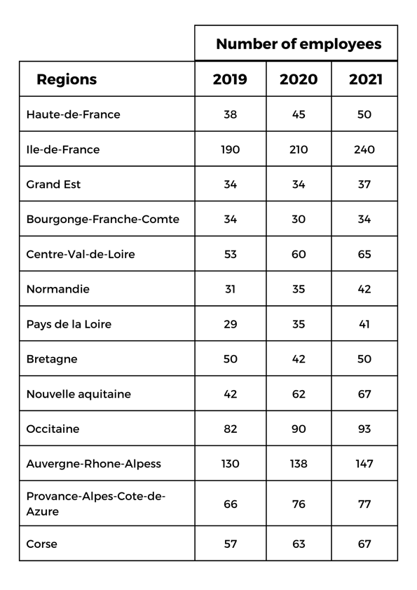
Consider this example. We want to find the number of employees by region in France and identify trends that occurred over the past 3 years.
Can you quickly identify evolving trends in this table? Can you explain it in simple terms to your audience?
Table: Regions / Number of employees
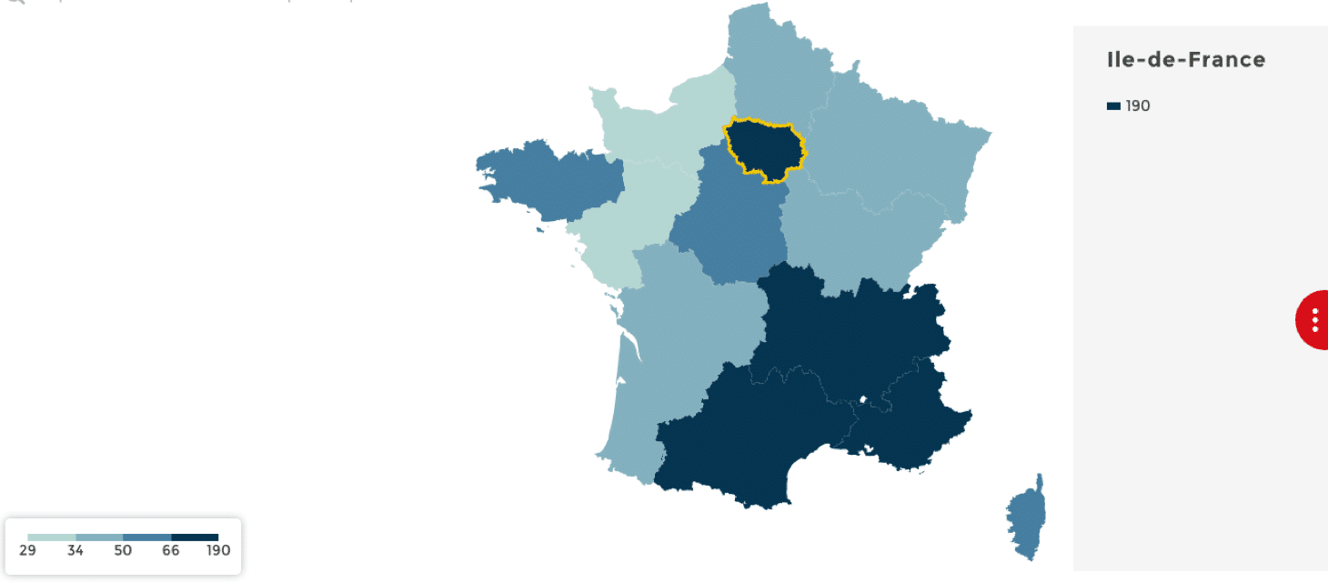
If we transcribe this information on a map by using a color swatch, the information is much quicker to understand and analyze.
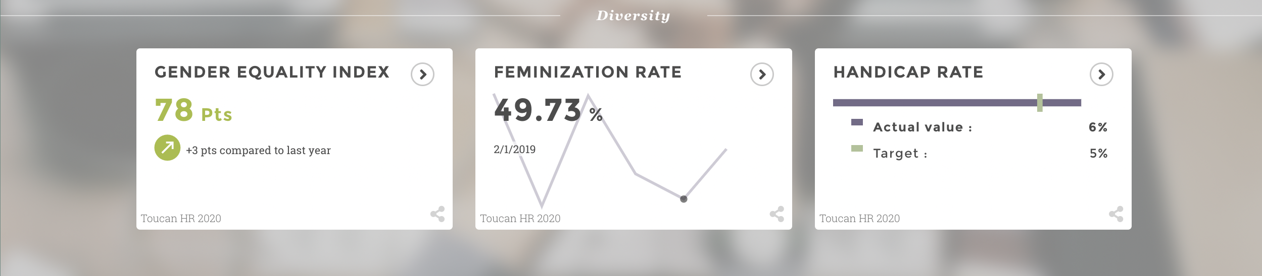
WHAT HR INDICATORS SHOULD YOU PRIORITISE?
Indicators for Recruitment
The recruitment process starts when a job is put on the market.
It ends when a candidate is recruited to meet business needs. This time can be used to implement actions which will then be analyzed to optimize HR processes long-term.
Indeed, indicators and KPIs are no longer a marketing exclusive. They must be used by other departments in your company – Human Resources in particular.
That’s why we decided to show you 5 examples of HR dashboards used by our clients.
Example 1: HR dashboard for workforce management
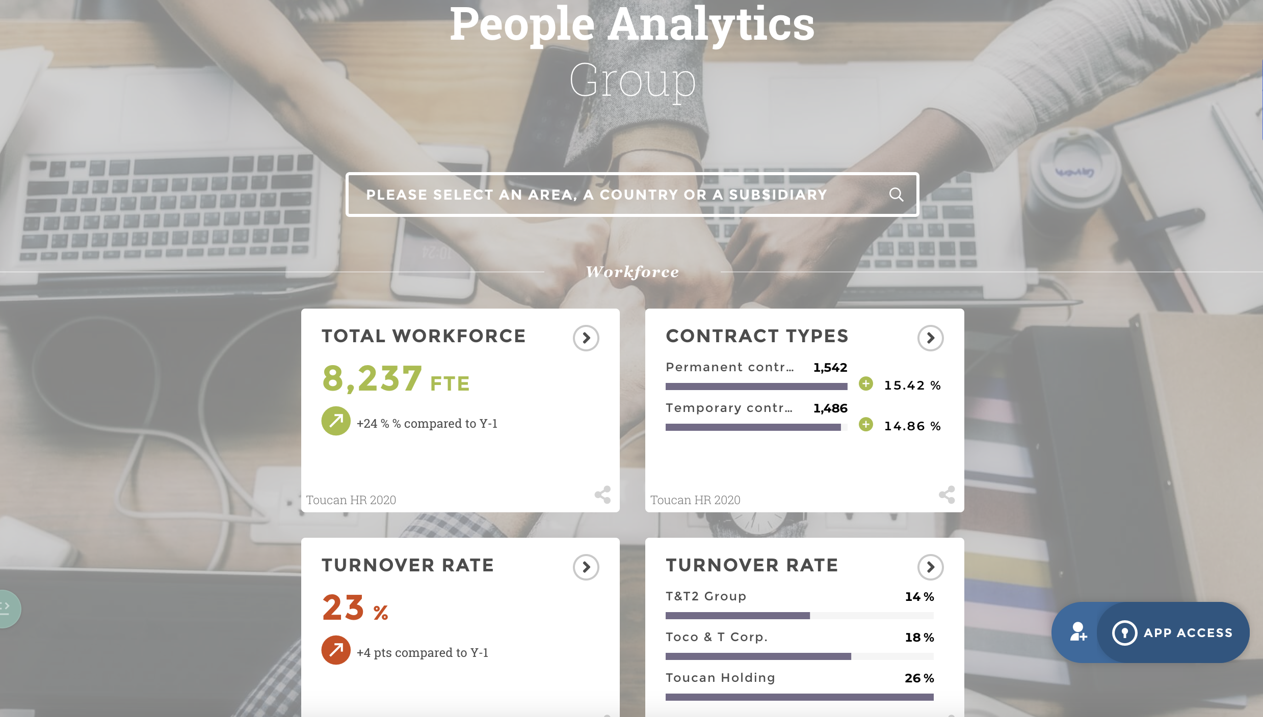
This first workforce management dashboard helps you pinpoint the evolution and distribution of your workforce in order to identify trends and predict your recruitment needs.
This is a very good way to anticipate actions and expenses related to recruitment for your teams.
Example 2: HR dashboard to monitor absenteeism
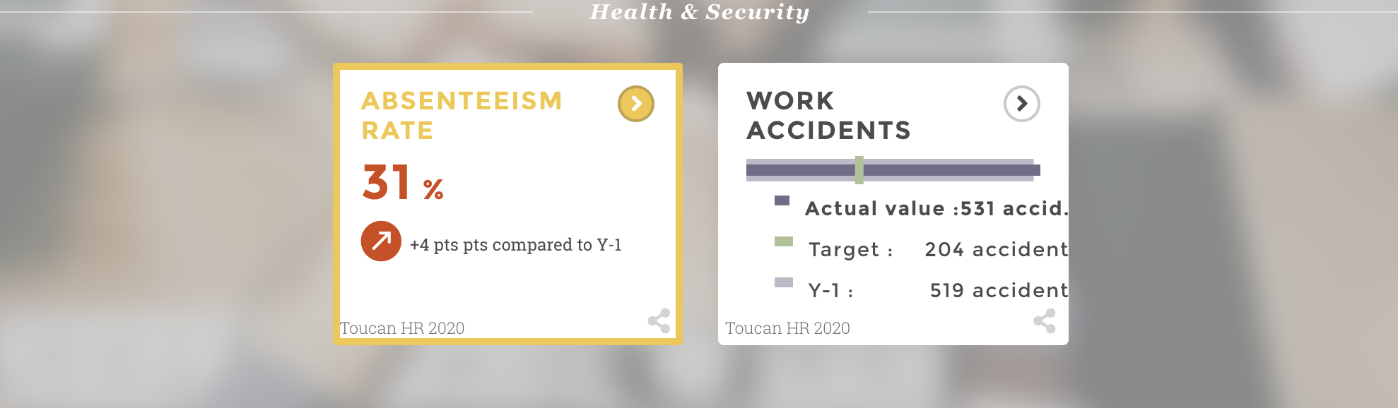 Absenteeism is an issue for any company. Building a dashboard to monitor absenteeism is essential to evaluate its rate and understand the reasons behind it.
A clear dashboard will allow to quickly extrapolate and to compare the given rate against the industry or other company departments.
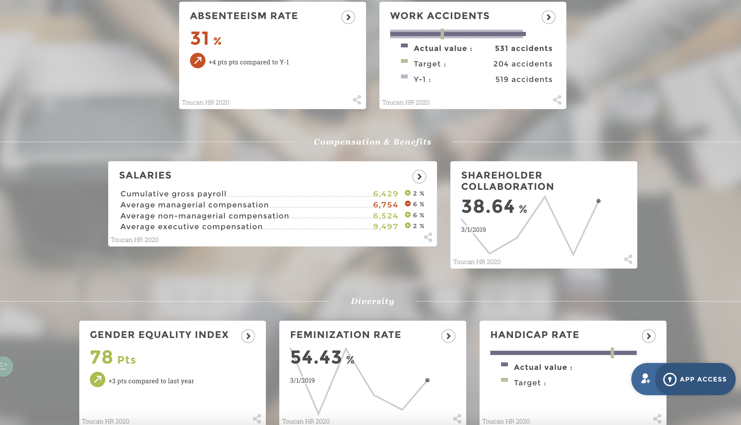
Example 3: HR dashboard for compensation and wage bill management
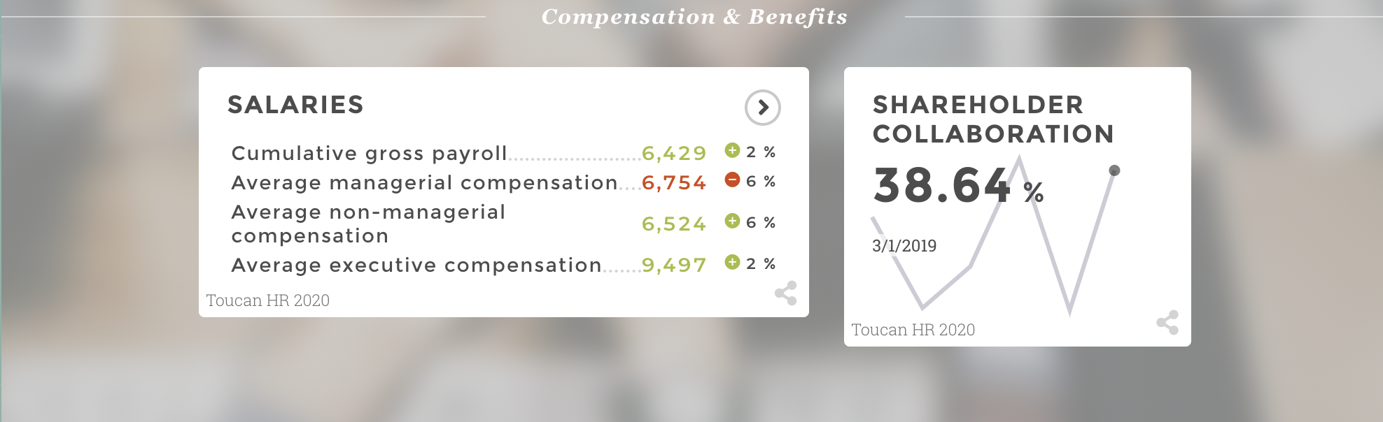
Every company must be able to control its wage policy through an effective compensation management dashboard.
Compensation tends to impact performance. It is also an asset in HR management’s digitalization. It helps define eligible groups, strengthen compensation offers, etc.
Example 4: HR dashboard for recruitment
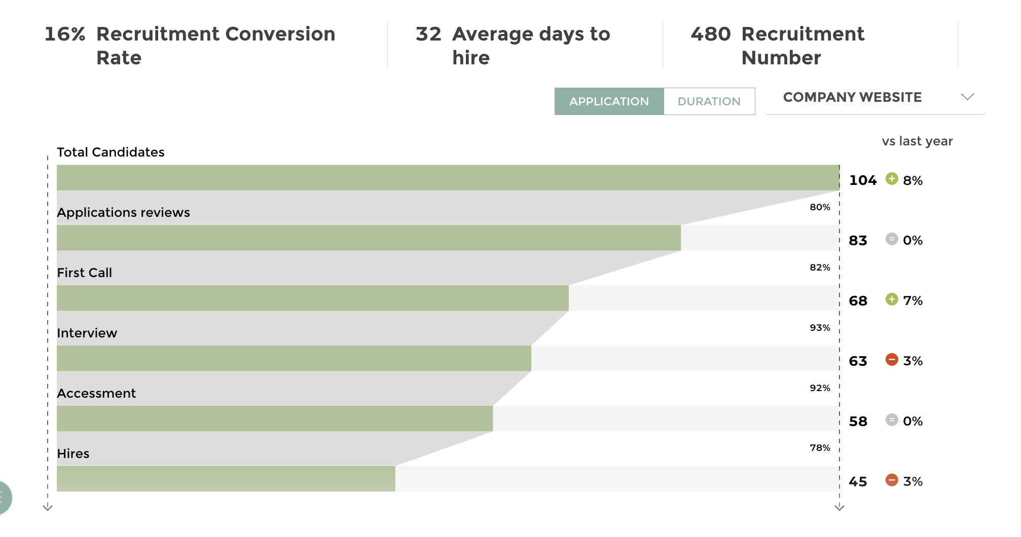
Lastly, recruitment is an inherent part of the life of a company. Having an HR reporting tool for recruitment will help facilitate some stages of the process.
Let’s take the recruitment process’ timeframe as an example. When it comes to changing things and implementing an effective action plan, you must be able to identify the steps that require more time!
The time between publishing your offer and integrating a new employee should enable you to understand the time required to recruit. You will also have an indication of quieter phases which can be used better to improve efficiency.
Example 5: HR dashboard for skills and talents management
 Skills management is a transversal HR tool to identify skills, assess internal needs, inform employees about their development or define new assessment methods.
You will spend your time analyzing, understanding, and communicating with your talents. Reprocessing and classifying your data should be simplified and automated.
HR DASHBOARDS: WHAT SHOULD YOU KEEP IN MIND?
HRM is changing and there are new reporting tools available today to help you with daily HR management tasks. To meet speed, performance, and efficiency requirements within the company, the best tool remains HR dashboards!
Indeed, they can centralize your key business indicators which are critical to the management of human resources. But they also facilitate the understanding of your data to make it accessible to a wider audience.
With these tools and data visualization, you can now add value to your indicators and make better decisions!
Want to find out more? Discover Nexity’s experience. They chose Toucan Toco to answer their HR problems.