One of the key components to Netflix’s success is the ability to leverage its data to inform decision-making. The company has invested heavily in the development of its own data visualization tool to provide relevant information, in real-time, to all of its stakeholders where and when they need it most.
Data visualization. Our brain needs less than 250 milliseconds to collect, understand and respond to visual information. Contrast that with trying to compare multiple tables of raw data? That requires effort and memory that is simply not possible once you hit a certain data threshold.
Quality data visualizations give people the ability to make sense of large volumes of data and generate actionable insights that are relevant for anyone, regardless of what level of decision-making hierarchy they are in. With strong data visualization tools, like Netflix's, employees are assisted in understanding their data and using it to collaborate and drive results. They can focus on their priorities instead of on data analysis.
Let's look at an example of data visualization at Netflix to bring this to life a bit more:
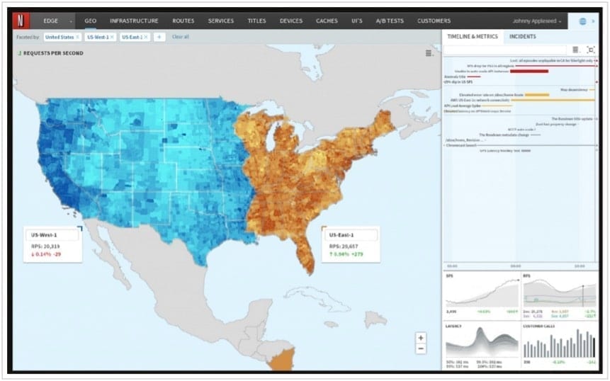
This visualization provides a real-time overview of connections to the Netflix platform in the United States. It highlights performance indicators with a map view on the main screen and, on the right-hand, illustrates incident tracking that's supplemented by performance indicators over time (such as the volume of customer calls and latency).
The layout is dynamic and can be customized by each user, providing a relevant, real-time understanding of incidents related to connections to the service.
Without this tool, assessing these metrics would be quite a headache. The data displayed above is aggregated from several sources and would otherwise be difficult for a typical employee to access, let alone monitor daily activities and prepare simple and relevant presentations for various stakeholders. This is what Netflix calls operational visibility.
The IMPORTANCE OF DATA VISUALIZATION FOR NETFLIX
Amongst Netflix's goal to become a more data-driven company is that of continuing to develop their data visualizations to help their employees, in real-time, identify anomalies, trends, and other such insights that help decision makers and improve efficiency (see more on their tech blog).
The implications of efficient data analysis are far-reaching for the company and apply to everything from improved customer support to driving product strategy like the creation of TV shows.
Let’s take House of Cards as an example, one of Netflix’s flagship shows which was created based on the analysis of subscriber data.
CREATING TV SHOWS BASED ON CONSUMERS’ TASTES AND PREFERENCES
Following an analysis of subscriber interests, data analysts at Netflix looked more closely at the audience of the original British show and discovered that the viewers were fans of actor Kevin Spacey and director David Fincher’s films.
Such insights enabled Netflix to create one of their highest-grossing shows and, unsurprisingly, the company renews over 80% of its seasons, while the industry average sits at 25%.
This is one of the many areas in which data analysis offers the company a clear competitive advantage. It helps them intimately understand consumer needs and provide targeted offers that make their customer base feel heard. Another way Netflix leverages its data is that again taking House of Cards as an example, it can develop many iterations of trailers for its shows each of which is targeted to specific audiences. Kevin Spacey fans are delivered trailers where the actor is heavily featured, whereas people more interested in content with female protagonists were targeted with a trailer focused on the series’ female characters.
UNIFYING DATA UNDERSTANDING
Data visualization has become a requirement for successful organizations, and we see it at all the major companies you know and love: Netflix, Twitter and Amazon are all no strangers to data viz.
Netflix owes much of its growth to its strategic use of collected data. With 150 million subscribers (and counting), the company possesses a colossal amount of information about its users, and the companies that survive are the ones that make use of it.
Furthermore, data visualization unifies data understanding. Indeed, raw data sets can be ambiguous, as all readers can draw their own conclusions. Data visualization nullifies this effect and makes data accessible and easy to share. Netflix uses dataviz tools to achieve its communication, reporting, and production objectives. Managers access their data in real-time. They can monitor the company’s activity while relying on predictive analysis to make more informed decisions.