


.png?width=88&height=88&name=portrait_agathe_face%20(1).png)
In this article, we'll present seven examples of data visualizations that touch on several subjects: cinema, art, philosophy, geography, gastronomy, ecology, or even literature and astronomy!
Definition
Data visualization ” refers to transforming figures and raw data into visual objects: points, bars, line plots, maps, etc." By combining user-friendly and aesthetically pleasing features, data visualizations endeavor to make research and data analysis much quicker and more actionable. Data visualizations in the form of dashboards becomes a go-to tool for many businesses to analyze and share their information.
“Data visualization is the art of depicting data in a fun and creative way, beyond the possibilities of Excel tables. In a way, it’s like setting figures to music.” explains Charles Miglietti, expert in data visualization and co-founder of Toucan.
This practice allows you to present complex raw data in a visually interactive way, empowering viewers with a new (and more effective) way of looking at information.
Though data visualization is most frequently used in a professional context, such as reporting in various departments, some visualizations offer a glimpse into data related to pop culture and more "run-of-the-mill" topics.
A lot of charts means a lot of possibilities, so be sure to choose the right graph for your data 🧠
Here are 7 examples of data visualization :
1 . Cinema: Explaining a movie plot through data visualization
Inception, a film directed by Christopher Nolan and released in 2010, that focuses on the themes of dreams and reality. The movie’s hero, Cobb, is an “extractor”, an agent that can enter someone’s dreams and learn their secrets, who collaborates with others on industrial espionage missions.
This simple, colorful, and interactive data visualization offers a detailed explanation of the film’s complex plot.(Warning ⚠️ SPOILER ALERT 🚨)
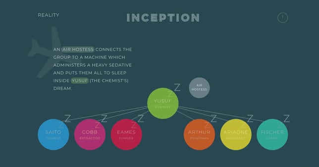
This visualization offers a step-by-step explanation of the storyline, guiding readers through each “dream level” of the film. It helps us understand everything: the role of each character, where they are, and which events happen simultaneously.

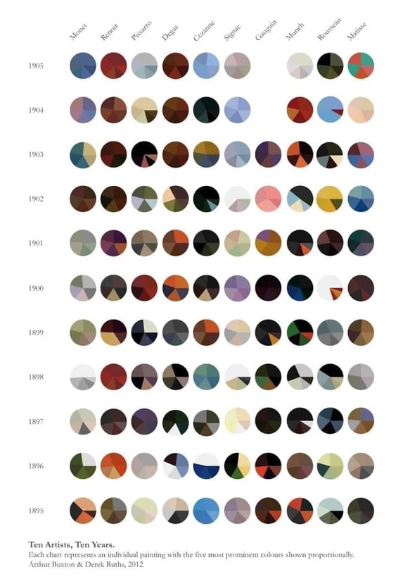
2 . Art: Analyzing the color palettes of great artwork
Arthur Buxton created a data visualization (shown below) that provides an overview of various color palettes used by several painters including Monet, Gauguin, and Cézanne, over a period of ten years. This offers a new perspective on these artists, sorting them by the colors they often employed rather than by a specific style or theme.
Over the years, we've created over 1000 dashboard projects and seen endless visualizations, so we created 10 UX best practices to help you build a dashboard based on data visualization. Check out our guide to data visualization!

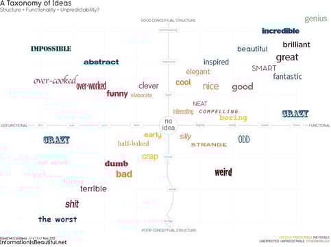
3 . Philosophy: A visual depiction of ideas
The data presented here is a direct reflection of concepts from everyday life. Ideas are presented and analyzed based on their significance, duration and the feelings that they evoke. Another interesting perspective!
4 . National Geographic: Cartography
This visualization shows how various different geographers worked to map the world, from 1915 to the present day.

By showing how these old maps were created, these images guide readers through the history of cartography.
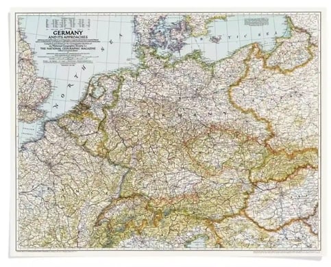
They help us understand the tremendous scope of these projects, and the challenging work geographers faced at the beginning of the last century.
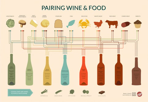
5 . Gastronomy in pictures
Here is a fun example of another data visualization that is directly applicable to everyday life: food and wine pairings!
6 . Data visualization through video
Data visualization can take many forms – though most are aesthetically pleasing, they are usually static images. However, videos can also be used to depict data. Take a look at the following visualization for everything you need to know about planet Earth:
7 . Literature and astronomy :
This visualization was named one of the most beautiful data visualizations of 2017.
It combines literature and astronomy in an extremely original way: the first sentence of a literary work is always unique. Here, the artist uses the grammatical structure of opening sentences from well-known works such as The Phantom of the Opera, Robinson Crusoe and Robin Hood, as well as the length and rhythm of the words, to create a diagram (in the form of a constellation) for each sentence.
Creating your data visualizations:
Entertaining and user-friendly data visualizations can, and often are, also be used in a professional context. Let’s take a look at an application developed by Toucan. The image features colorful dashboards and indicators, as well as a humorous depiction of impactful information.
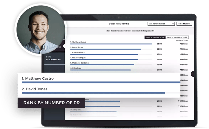
The drop-down menu on the left allows users to explore various different subjects. Let’s take a look at women in tech!
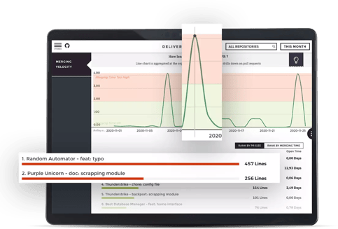
The data here is easy to understand thanks to a number of things: the color palettes used, the clarity and simplicity of the indicators used to display the information, and so on (see more below). In summary, the application allows users to learn a lot about the topic at hand in a short amount of time!
Common features of Impactful data visualizations
All of the data visualizations we explore include the following features :
- Indicators: These show the hierarchy and organization of a collection of data on a given subject. They highlight the most important information.
- Simplicity: The information is clear. “A picture is worth a thousand words”. The reader understands the information at hand immediately.
- Brevity: The message is short and clear, and no unnecessary information is displayed.
- Originality: types of data, that seem unrelated at first glance, are collected and displayed in a way that offers viewers a new perspective on the subject. Visualization #7 is a good example of this.
- Color: to draw the reader’s attention to the most important pieces of information, clear and easy-to-understand color palettes are used.
- Aesthetics: The graphics are lively, well-designed and generally pleasant to look at.
All of these visualizations are also very informative. Readers can quickly learn about the information at hand. Some visualizations let readers go even further by interacting with the data that is presented to them.
Data visualization offers a fun new perspective on content that may initially seem uninteresting or incomprehensible. These seven examples show us that the only real limit is your imagination!
Toucan is a customer-facing analytics platform that empowers companies to drive engagement with AI embedded analytics. Ranked the #1 easiest-to-use analytics solution on G2 Crowd, their no-code, cloud-based platform cuts custom development costs with a quick and easy implementation, even for non-technical builders. To find out what our users say, read their reviews on G2 Crowd.
.png?width=112&height=112&name=portrait_agathe_face%20(1).png)
