“Want me to draw it out for you?”
We’ve all likely heard this sentence, or some iteration of it, before. Things are no different in the working world, where business data is often abstract and difficult to understand (especially for non-technical people). To become actionable, data needs to be simplified and contextualized. Insert Data Storytelling, a modern solution to the plight of those who don't get the value they need from their data.
A simple definition of data storytelling
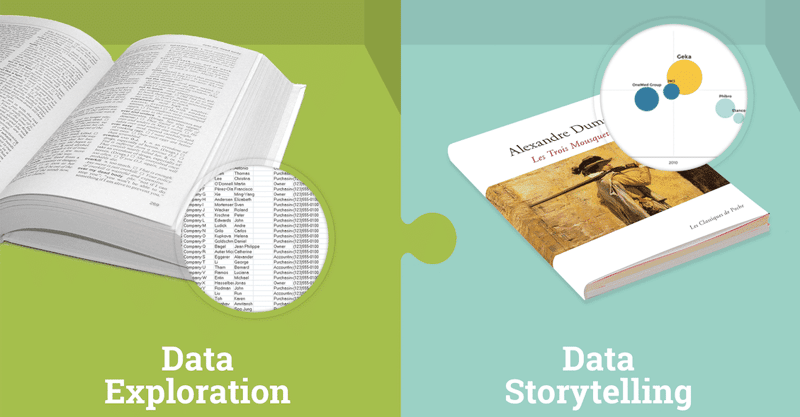
Data Storytelling is the ability to tell a story with data and to personalize that data based on the audience its going to be presented to. For example, a Marketing Director doesn’t have the same reporting needs as an operational manager who's responsible for digital campaigns.
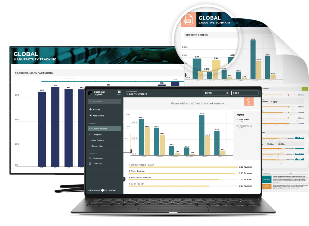
This category of Business Intelligence has it's roots in data visualization (or Dataviz), which is the art of illustrating data in a clear and pedagogical way (which is found lacking in Excel or other comparable software). Dataviz enables us to communicate complex figures and information by transforming them into visual objects: graphs, diagrams, curves, maps, and so on.
And this fascinating stuff is no longer only aimed at, or available to, data and BI departments in large corporations, but to anyone who wants to do more with their data.
Why is data storytelling Such a Hot Topic?
Nowadays, we're flooded with data. But most companies still face a lot of the same problems when it comes to analytics and making use of that data:
- Complexity
- Too many analytics software options and no idea what to choose
- Alignment and a shared vision
A few years ago, the holy grail seemed to be the retrieval and collection of as much data as possible. Many companies technically succeeded in this. But, as the saying goes, if you get to your destination using the wrong map, you're not where you wanted to end up. That's a saying...right?
Well, in our attempt to make analytics fast, powerful, all-seeing, and all-knowing, they've also become incredibly hard to use. Data continues to be collected, but unfortunately, it only tends to get used by a minority (usually C-level positions) in any given company. This naturally created reliance on an army of data scientists, data analysts, and other data experts to provide quarterly reports and insights. Sound outdated? We think so too. Researchers agreed as well, finding that:
- 77% of businesses report that "business adoption" of big data and AI initiatives continues to represent a big challenge for businesses. (NewVantage survey)
- 87% of data science projects never make it into production (VentureBeat AI )
- 80% of analytics insights will not deliver desired business outcomes through 2022 (Gartner)
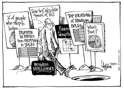
Today, mentalities and challenges are evolving. Data collection has become a means, not an end; and the objective is now to make decisions daily, simply and quickly.
Data storytelling is already here
We all love stories. Whatever their context, they allow us to convey otherwise complex information in a playful, more digestible way.
Data itself is a bunch of 0s and 1s, but when communicated with narration, context, and visual appeal, it becomes the difference between wild success and failure.
Want to go further? Here are 10 Design & Data Storytelling Best Practices for Untrained Users
Examples of leveraged data storytelling
Spotify wrapped, the king of music data
Let's use Spotify as one example of just how powerful Data Storytelling can be. Well ahead of the curve (circa 2015), the streaming giant decided to present data about users' listening habit including:
- Musical genre
- Total listening time
- Favorite podcasts
- Top tracks
Spotify sought to leverage its data not only to better understand user behavior but also to engage them with a vibrant, colorful data storytelling narrative. These features probably look both familiar and pleasant to you; these sorts of data stories have been shared the world over by happy Spotify users who consistently take to social media to share their favorite playlists, tastes, and habits with their online communities.
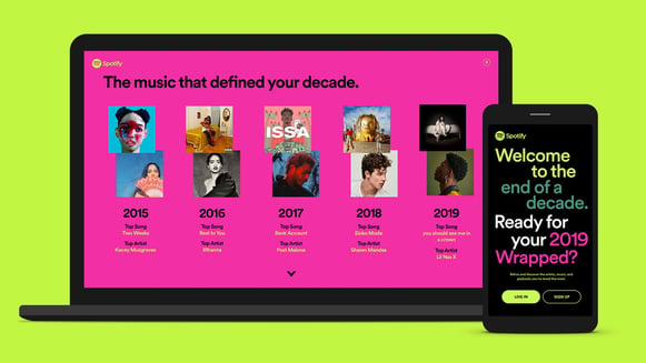
Each December, Spotify users can access their personalized data story and view their shareable experiences. The data is dynamic and the algorithm automatically generates a playlist of each user's top 100 songs from that calendar year. In this case, Data Storytelling provides both the company and its user with valuable insights that have improved both business performance and the user experience (both of which quite obviously go hand-in-hand).
Spotify leverages data stories in a number of other ways, including comparing music tastes across countries and demographics to better understand targeting and artist development.
This example highlights the power of narrative as a vehicle for data delivery, with the UX serving to enhance the experience.
The internet and its networks!
Let's look at another example: the internet!
Internet Live Stats records all interactions on social networks, including:
- Tweets
- Instagram likes
- Minutes spent on Skype
- Number of YouTube videos watched
All of these user behaviors are tracked. Down to the second. Pretty cool, right?
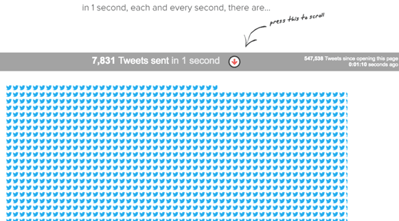
The data presented are not static. In fact, quite the opposite! Stay a few seconds on the site and you will see new Twitter birds taking shape.
Again, rather than a simple number updated every second, we're presented with compelling visuals that reinforce, and bring to life, the fact that things are happening faster than we can comprehend.
Data storytelling makes your business life easier
The status quo is changing. In years past, most companies have used the same cookie-cutter Business Intelligence tools like Tableau Software, Qlik, or Business Objects.
These are all excellent tools in their own ways but, as we mentioned, their use cases are quite limited to data experts.
But with data storytelling and guided analytics tools, this is no longer the case.
Let's illustrate this with an example: I want to know the number of sales of a pair of blue shoes, the ABC model, between December 20th and 26th in my shoe store. Data Storytelling takes the opposite approach of these tools I mentioned above by addressing data novices. As business users' time is limited, they need a tool that can simplify their reading and decision-making using instantly available data.
Used efficiently, Data Storytelling can revolutionize your business:
- Turn your data into action. With clear and usable data at your disposal, you are able to quickly identify trends and possible strategies for your business.
- Improve the productivity of your teams. Data is automatically presented in a simple and interactive way. Their time is thus concentrated on tasks with high added value.
- Find more agility in your decision-making. Thanks to a simple and easy-to-use tool in a context where decisions must be made more and more quickly, you reconcile your CIO and the business teams.
The classic meeting case
Let’s take the case of a Sales Director at a monthly Decision Committee meeting.
Every month, he or she presents the ranking of the top ten countries in terms of sales volume. Our Sales Director is used to making this kind of presentation and runs it on PowerPoint backed by an Excel database with 5000 lines behind it. Sounds like a disaster waiting to happen, huh?
In our example, today's committee really wants to get into the weeds. More specifically, one of them wants to look more deeply at the top 3 regions, both in terms of volume AND value.
Ouch, that wasn’t part of the plan. The dozens of Excel files with the relevant data exist, but the information isn't directly available. Add some frozen PowerPoint slides to the mix, and that's one embarrassed Sales Director…
With a tool adapted to this type of context, that embarrassment could be pride.
However, the question was simple and very practical: to go from a Top 10 overview to a Top 3 with a little more detail. Data Storytelling, combined with a powerful tool, could have allowed him to easily navigate through the data and retrieve the information within seconds.
data storytelling: making data actionable!
In tools like Toucan, you get the context that makes data actionable and triggers operational actions.
The complexity of enterprise data projects lies in the combination of indicators from different sources:
- Flat files
- Data from internal tools
- Data from commercial tools
The objective is to link all these data to produce actionable insights.
On the scale of a large group, such a project resembles an endless labyrinth. We aren’t even talking about the case where the project has an international dimension, with dozens of countries and subsidiaries to be aligned on the same frame of reference.
The challenge is to obtain a unified vision of the data, regardless of the geographical area or the tools deployed in each department.
Change in this area is incoming. We must finally be able to use the data available in an efficient UX: it’s a gold mine of relevant information to make better decisions every day!
Fortunately, Data Storytelling is a fit for anyone who wants to understand the essentials of data and use it to make better decisions.
Whatever your project, keep in mind that interactivity, storytelling, and collaboration work! The tools to make it happen aren't scarce anymore, and they can give you a leg up on the competition without discrimination.


.png?width=710&name=DOMO%20Testimonial%20%20(5).png)

