Back


Horizontal Barchart - What is it?
A horizontal bar chart is a graph in the form of rectangular bars. It’s a data visualization technique.
The length of these bars is proportional to the values they represent. The bar chart title indicates which data is represented. The vertical axis represents the categories being compared, while the horizontal axis represents a value.
This type of chart provides a visual representation of categorical data. This data is grouped together as a group. Examples include months of the year, age range, shoe size, or animal species.
To create a horizontal barchart, first choose an appropriate scale based on the data values. Then mark the data categories on the vertical axis and the values on the horizontal axis.
The bands for each data category should then be drawn. Finally, the appropriate title for the chart is chosen, along with a reference to the scale used.
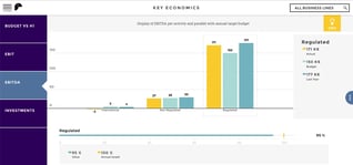
A horizontal barchart in our tool Toucan
The main difference with a column graph or vertical bar graph is that the x-axis and the y-axis are reversed. This is an interesting specificity for several cases.
The benefit with a horizontal barchart is that the labels are easier to display. In addition, they are more suitable for display on a mobile device in the case of a large data set/.
It is also possible to indicate a first reading by the bar length and a second reading by the bar color. For example, in a species graph, the number of species representatives can be indicated by the bar length. The color can indicate whether the species is threatened or not.

Learn how to use the right chart in your dashboard

The horizontal barchart is therefore the best tool for displaying comparisons between several categories of data. Horizontal rectangles leave enough room for textual information and are therefore ideal for long data labels. In general, this graph is suitable for categorical variables. Examples include ice cream flavors, company types, or car brands.
These variables can be arranged in any order on the graph. In general, it is recommended to sort them so that the most interesting item is displayed first. On the other hand, if the variables to be displayed are ordinal, it is preferable to use a vertical column diagram. Ordinal variables follow an order, i.e. a natural progression. They are also called sequential variables because their subcategories have a natural sequence. The vertical bar graph highlights this order.
And here is an example of a horizontal bar chart in a financial context