The guided experience is everything for Toucan. Enabling our users to have a complete understanding of their data at first glance is at the core of our products. Therefore, we couldn’t be more excited to announce a new update dedicated to the user experience.
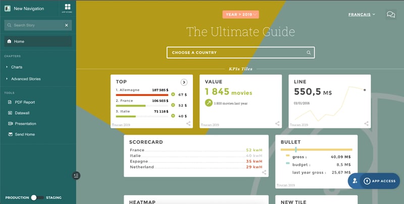
In recent months, the Toucan team has been hard at work developing a sensational update that reworks the app navigation. These changes streamline the user experience and offer an actionable modern design, empowering how users interact with each Toucan App and data story.
. 
Smoother navigation reveals the full potential of Toucan
Previously, users were unable to discover the whole toucan experience as not all features were directly displayed. Whether you were exploring an app or creating a new data story, it took multiple steps to access available features and explore the product in depth. This could lead a user to spend too much time searching for a story or sharing one.
What’s changed?
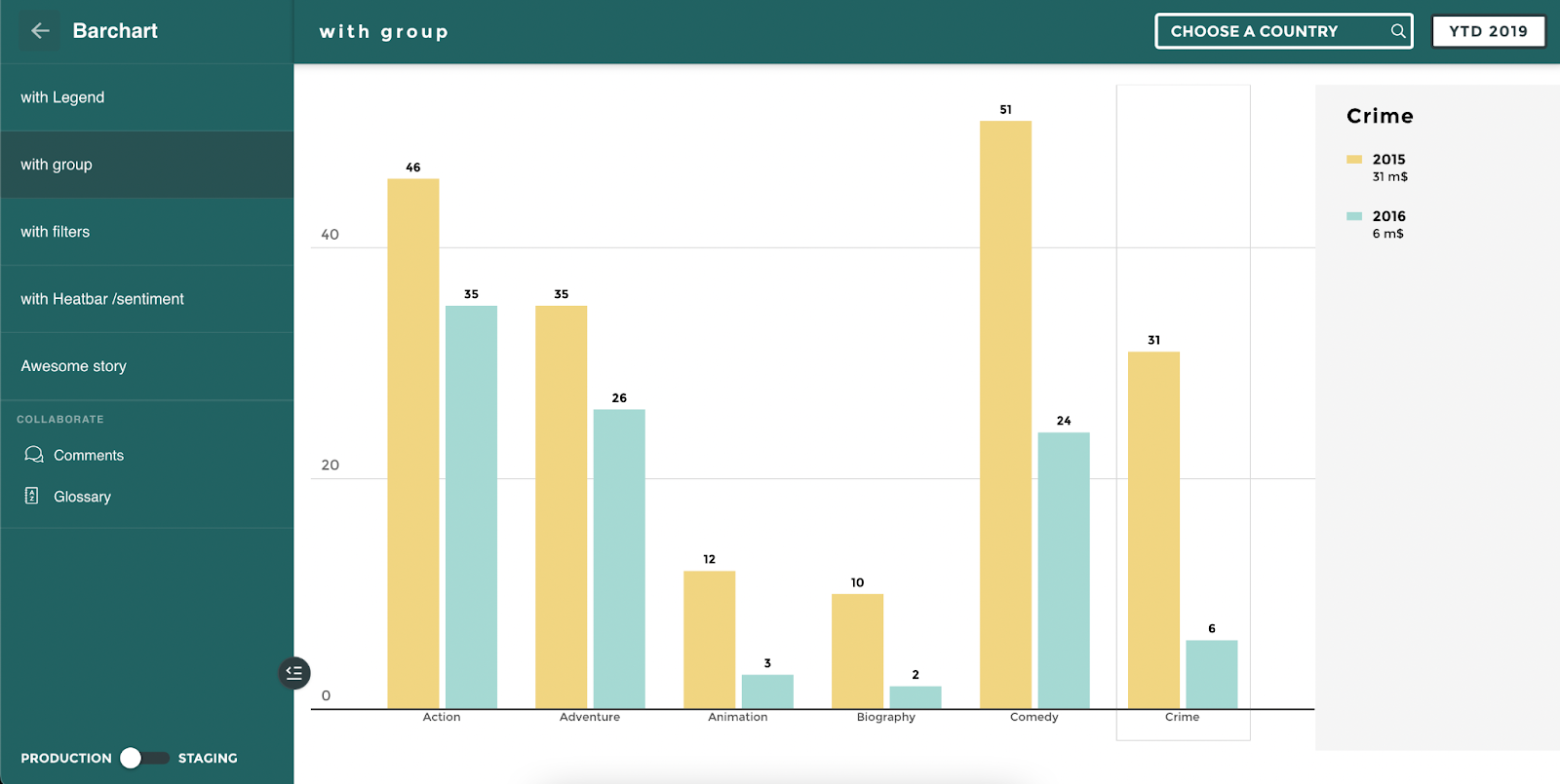
Toucan now lets you have a full overview of your entire application, from the optimized menu. It streamlines your access to all the different collaborative options, as well as creation options, directly from the menu. Now, you can find indicators easily thanks to the new search function or hide the menu to have better visibility of your insights.
"The release of our new navigation is a real game changer for Toucan’s user experience. I am very happy to see how much our clients are able to take their adoption even further thanks to the teamwork of all our teams pushing to provide only the best quality and best experience possible."
How you can leverage this
This new navigation offers exciting new opportunities for not just app builders, but end users too.
As App Builder, the main highlights are:
- Increase the discoverability of your own work thanks to a better placement of tools such as Glossary, Share tools, and MyFavorites!
- A search bar to increase your speed when it comes to modifying a specific story!
For your End Users:
- Simple overview of the structure of a given App!
- Ability to search for a story with keywords!
- Switch to full-screen mode to focus on a story!
We couldn’t be more excited to announce Toucan’s latest product update: new UX navigation. If you want more insight into the update, check out the complete release note here.
Ready to find out how else Toucan Guided Analytics can help your company? Request a demo to find out!


