Why Data Storytelling Exists
Dashboards have been the data visualization tool of choice for the past 3 decades. The dashboard was destined to give data analysts the capabilities and flexibility to visualize and explore unknown datasets and saw great success in doing so. Once the data analyst market was flooded, vendors pushed the dashboard onto the desks of business users with the conviction that they too needed to explore data. However, Gartner reported that the adoption of analytics has been stagnating at 32% for the past years, thus challenging the need for the large-scale adoption of data exploration amongst business audiences, and opening up a conversation about the need – and the method needed – to simply communicate clear, pre-defined, accessible insights instead.
Legacy, modern, and even newer BI vendors are trying to address a new challenge with old tools and approaches. Dashboards were meant for small-scale usage amongst data teams needing nuance and complexity built-in an analytics product to explore unknown datasets from every angle possible. Unlimited customization and countless capabilities made for complex analysis are what you’re paying for. However, deploying dashboards for the sake of communicating insights on a large scale is an extremely challenging task due to the numerous factors that must be taken into consideration for the production, adoption, and maintenance of the deliverable. These include devices used and their screen size, the data literacy level of your audience, user roles and permissions amongst others. Speaking to users, the deliverables are often confusing, require training, don’t age well, and appear as old tech, compared to the advancements of B2C tech that we all use in our everyday life.
Data Storytelling is the association of context to data; an insight communication practice launched by large BI vendors as a temporary alternative to the dashboard; whenever a discrepancy in the data appeared and needed to be shared, discussed or acted upon. Leading BI vendors have been marketing the practice for years but, despite being a compelling proposition, data storytelling has remained a supporting capability for dashboard-based products and was never turned into an analytics category of its own.
The reason for this might be two folds:
- Effective Data Storytelling is understood as being only a communication skill, rather than a combination of skill and product. This has led BI vendors to offer data analysts/data storytellers the same approach as that of dashboards: start with a blank sheet, and build as you will. This approach may be appropriate for small-scale deployments within teams of data analysts looking to explore data but is not a scalable practice when it comes to deploying accessible deliverables at scale. With an interpretation of data storytelling being built on skill only rather than on skill and product, BI vendors and their customers do not see the need to have data storytelling as a separate category of analytics, with data storytelling products.
- The conviction that nothing could replace the dashboard for insight communication use cases, that Data Storytelling complements the dashboard on occasion only and cannot provide the same recurrency needed to monitor performance on a regular basis has kept data storytelling in the shadow of dashboard-based products and has been used a new and sexy capability to market. So much so
- Introduce the idea that data storytelling was never thought of differently because the dashboard was the only way to consume data means data storytelling is a capability. But a good interest because diff versions. But couldn’t differentiate because of a lack of capabilities.
- The belief that data storytelling isn’t meant to replace dashboards for specific but common use cases has led to the development of different data storytelling techniques such as PowerPoint-like / Show-Then-Throw slideshows, infographics, and blog-like storytelling, which adds differentiation in a BI vendor’s storytelling offering but were not actually designed to replace the dashboard or address the issue of low adoption at scale.
Different data storytelling techniques have seen the light of day, including PowerPoint-like / Show-Then-Throw slideshows, infographics, and blog-like deliverables, but despite proposing a compelling new way of communicating insights, these techniques. Incorporating aspects of data storytelling into the regular analytics deliverable for business audiences would be a strong alternative to the dashboard. However, the existing methods for creating data stories do not allow this, due to 2 main reasons:
- Data Storytelling was not designed to be a recurrent or an updatable deliverable. It was made to be a one-time-only product that engages an audience on a specific matter at a specific time. Aside from the addition of context to data; a characteristic all data storytelling techniques share is the understanding that a story is deliverable-long. This means that a data story must start at point A and finish at point Z, meaning that changing a single KPI in a data storytelling deliverable would change the entire meaning of the message one is trying to communicate, thus enforcing the need to rework the entire deliverable at the slightest change. This reinforces the idea that Data Storytelling deliverables are single-use deliverables.
- Producing a data storytelling deliverable follows the same manual, subjective, unguided, design-as-you-will approach of dashboards: start with a blank sheet of paper, place whatever you please wherever you like. This type of practice usually leads to long production times, a subjective deliverable quality, and unscalable practices.
This has kept data storytelling as a second-class analytics deliverable, behind the dashboard.
That is until Industrialized Storytelling came along.
Industrialized Storytelling is a new technique that combines the narrative requirement of stories to the recurrence of dashboards. The qualifier “industrialized” is a reference to the heavy-duty, solid, sturdy, reliable reusable products found in certain industrial-grade productions. It’s also a reference to the idea of industrializing a process within the IT world, projecting the idea of a scalable, standardized, repeatable process. Industrialized Storytelling addresses the low adoption rates at scale by taking as much subjectivity out of a deliverable and putting it into the product. An example is the integration of a built-in User Experience in the product, which ensures a high standard of design quality for end-users, independently of the builder’s design competencies, and a consistently clear message delivered by the builder. By providing an in-product framework for storytelling, data analysts need not waste time on design or deployment, nor do they need to worry about the data literacy skills of their audience or the device type they use; as the UX takes into account deployability. Consistent clarity, ease of use, and wide accessibility provide a compelling solution to an otherwise cumbersome, cluttered, complex, and unfit deliverable for business audiences.
Main Findings:
- Dashboards have been the tool of choice for communicating insights for the past decades, however recent studies show low adoption rates amongst business users.
- Data Storytelling was brought in as a supporting capability to the dashboard with the aim of engaging business audiences on an occasional basis when urgent matters need discussion, data-driven decision-making, and action.
- The different types of data storytelling have their strengths, however they were never designed with the intent of replacing the dashboard as the principal tool of choice when the use case is about communicating insights, and that only. This is due to the similar design-as-you-will approach of the dashboard, thus leading to manual work, obstacles to scalability, inability to repeat, and inconsistent design.
- Industrialized storytelling is a new type of storytelling that aims to replace the dashboard all while helping organizations communicate clear and compelling insights at scale. It does it by integrating a built-in user experience that packages design best practices (no pie charts, a single font, no more than 2 charts per screen…) to data storytelling practices (narrative environment, glossary…).
What is Storytelling?
TDWI defines storytelling as the practice of building a narrative around a set of data and its accompanying visualizations to help convey the meaning of that data in a powerful and compelling fashion.
This definition can be separated in 2:
Theoretical Storytelling, or how to design a narrative.
This is where an analyst or storyteller decides the order with which KPIs should follow one another in order to give gradual, logical, bite-sized pieces of information to their audience. The order of those KPIs should guide the audience through the narrative in such a compelling way that they are left with no other choice but to make a decision. The ordering of KPIs can take several forms, as reported by James Richardson of Gartner:
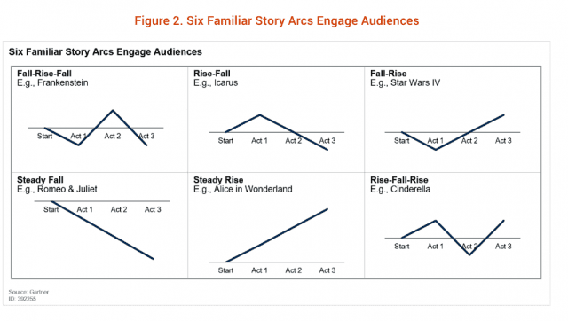
Source: Gartner
A majority of storytellers focus on this specific part of storytelling, which is about what you want to say. Numerous resources exist to explain how to design a narrative, which is why I won’t cover this topic here.
Executional Storytelling, or how to deliver that narrative.
A painter will start by envisioning a drawing before choosing between a linen canvas, a A4 paper or a fancy papyrus to deliver their envisioned drawing to the world. Each support will be best adapted to a certain use case, and each will require a specific technique. Similarly to a painter, once a storyteller has a clear idea of the story, or the order of the KPIs they wish to communicate, they have the choice of several storytelling techniques to execute their vision.
Several types of storytelling techniques have seen the light of day, each with its own strengths. This article will focus on the different types of data storytelling, which is how a data story can be delivered on a practical, executional level.
How? The Different Types of Storytelling Techniques
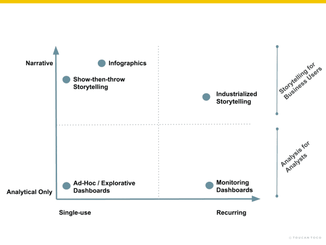
If storytelling is defined by the addition of context to charts, then the different types of storytelling differ in how rich their contextualization is, and how recurring the deliverable can be.
The different types of storytelling can be defined and compared based on 4 criteria:
Single Use vs Recurring:
- Single-use: a deliverable created for a single event and/or short-term basis, with a goal of either driving a collective decision at once, or informing an public audience. The deliverable is consumed once and then dismissed.
- Recurring: A deliverable used as a tool for decision support on a recurring basis. It may require updates every now and then, but is designed to serve a long term need.
Analytical Only vs Narrative:
- Analytical Only: a deliverable focused on exploring a data set to find correlations and causations, with no particular attention towards context or focus on communicating efficiently.
- Narrative: (analytical + narrative) “in addition to the analytical nature, it also contains” a deliverable containing contextual information surrounding a chart, allowing the user to understand the context within which the data is being reported.

Today’s most well known types of storytelling techniques, which are infographics and Show-then-Throw storytelling, aren’t direct challengers to the dashboard. Indeed, data storytelling was created to highlight a particular discrepancy in data found in a dashboard at a specific moment in time. In other words, storytelling found high adoption amongst business users because of the clarity delivered through the presence of context and structured consumption format, yet dashboards found low adoption because of the lack of narration and ever-changing look and feel.
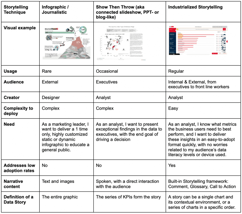
Infographic / Journalistic Storytelling
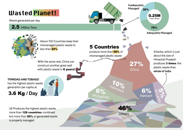
What is it:
An infographic is a collection of imagery, charts, and minimal text that gives an easy-to-understand overview of a topic to a general, unfiltered audience. It is used when you need to educate or inform your readers about a specific event. It is a temporary, highly customized, static or dynamic document created by a designer to be inserted on a public document or website, relevant to news or current events, and for an external audience.
Strength:
Clear, interesting, compelling solution that can be used as a promotional tool.
Weakness with regards to addressing low analytics adoption rates at scale
Infographics take time to deploy, require design skills, and are not a scalable solution to address the low rates of adoption at scale. In other words, infographics will not replace dashboards.
Mobility:
Depends on the use case.
How is it created:
Some vendors may offer this service directly in their platform, but infographic makers may also design them in design-specialized software.
Future usage:
Used around 1% of analytics use cases, due to rare necessity.
Show-Then-Throw / Connected Slideshow Storytelling
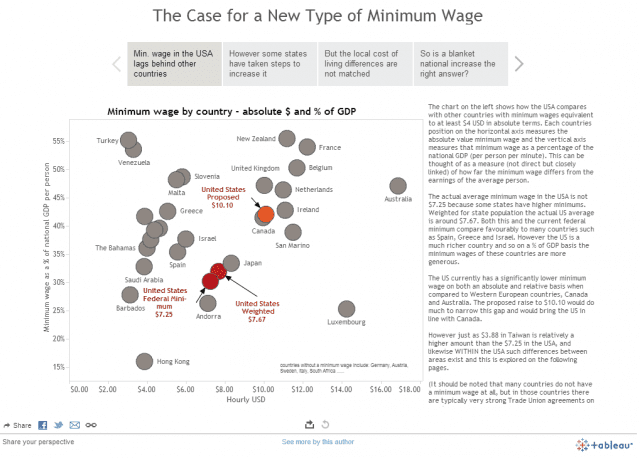
What is it:
It’s a PowerPoint-like, built-in capability, that allows a data or business analyst to “screenshot” charts at a specific moment in time and place them on a single-use, slideshow-like support to be presented to an audience (of executives, usually). Show-then-throw storytelling is not meant to replace dashboards, exploration, or self-service BI. It’s a temporary solution meant to explain an unusual discrepancy in the data, a key learning in the business, or an answer to a user question. Once the presentation is made and the decision is taken, the static, temporary presentation is thrown away (hence the naming “ Show-Then-Throw”).
Strength:
A great solution is to present extraordinary findings quickly to an audience, knowing that the analyst will have to be present and will have to narrate the findings.
Weakness with regards to addressing low analytics adoption rates at scale
Requires the presence of an analyst to narrate the findings. But investing more time in order to enable autonomy requires expertise. If expertise determines the quality of the outcome, the impact of the solution becomes subjective to an analyst’s communication or storytelling skills, making it hard to repeat easily, which makes it unscalable. Generally speaking, the practice is reserved for executive-level presentations because there is a lack of supply for lower-tier audiences. The show-then-throw capability doesn’t offer design or user experience guidance to the storyteller.
Mobility:
Unfriendly, requires skill to set up.
How it is created:
Start with a blank sheet of paper and design-as-you-will. The analyst is given empty slides that they can fill by importing static charts selected at a specific time. The analyst can add notes, text, graphs, images, colours, fonts at will and however they like. The deliverable is subjective to the storytelling skills of the analyst.
Future usage
Less than 10% of analytics use cases, due to occasional necessity and a step ahead in marketing efforts by big BI players.
Industrialized Storytelling
What is it
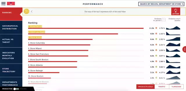
Also known as the Wix.com or SquareSpace.com of analytics, Industrialized Storytelling (I.S.) standardizes the quality, clarity and actionability of your deliverables, independently of the analyst’s communication or design skills. The I.S. products have a built-in User Experience that packages design best practices (no more than 2 charts per screen to ensure consistent clarity, a standard font to ensure readability, no pie chart…) and data storytelling best practices (built-in narrative section to ensure autonomy, a built-in glossary to align teams on KPI definitions, built-in call to action to guide users), for the sake of consistent and clear communication of insights, rapid deployment and ease of adoption by untrained business users, at scale.
Strength
Clear, consistent, compelling insights delivered on a regular basis, without the need for skill or expertise. Speed of deployment given the built-in User Experience, and the instant accessibility on all devices. The ease of adoption by business users given the right, built-in balance of graphics and contextual elements.
Weakness with regards to addressing low analytics adoption rates at scale
Designed specifically to address low analytics adoption rates at scale, by replacing the dashboard.
How it’s created
Anytime an analyst or business user understands what insights are necessary to monitor on a regular basis, a BI Practitioner will set up a data storytelling app using the guided framework for storytelling to combine the relevant charts with their contextual narrative. Deployment is fast thanks to the built-in UX and mobility.
Future usage:
90% of analytics use cases, given the replacement of the dashboard.
Conclusion
Helping business users boost their performance by gaining access to clear, contextualized, and compelling insights on a recurrent basis and at scale wasn’t possible until the rise of Industrialized Storytelling. Contrary to the Show Then Throw and Infographics types of storytelling, Industrialized Storytelling integrates a built-in User Experience for the sake of speed of deployment, the objective high quality of the deliverable, and the integration of a narrative environment that provides concise context every step of the way. Providing contextualized insights to business users in a recurrent, clear, and scalable manner wasn’t possible until today.


