Data visualization is one of the best ways to view and analyze crucial organizational data to gain insights and make data-driven decisions that grow your business. There are numerous benefits to compelling, engaging data visualization, and if your organization hasn’t taken advantage of visualization yet, now is the time.
An estimated 65% of people learn better through visual presentation of information than written information, making data visualization undeniably important to communicate key details. But what is data visualization, how does it enhance the customer experience, and why should you implement visualization tactics? Read more to find everything you should know about data visualization and its importance.
Understanding Data Visualization
Simply put, data visualization is an engaging way of turning raw data into a cohesive, easy-to-digest format that people can look at and instantly understand. It gives you the power to communicate information and numbers visually in different forms and an appealing design.
There are several types of engaging data visualization:
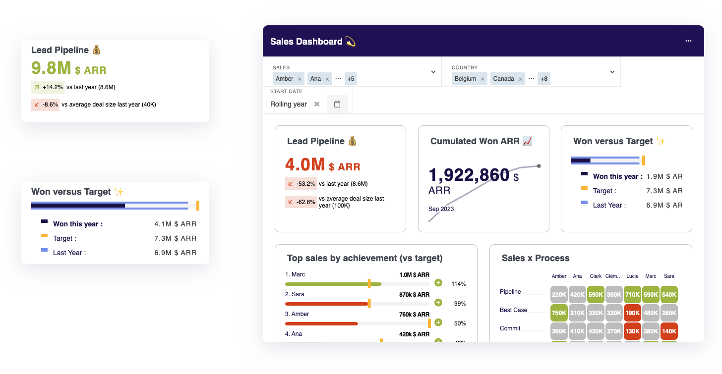
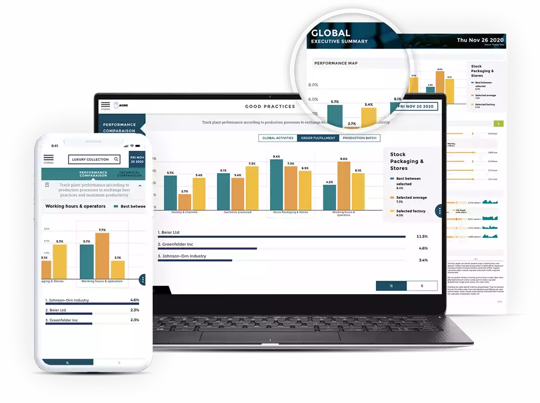
- Bar charts: These charts are used for comparisons and categorical information. They use bars of different lengths to represent data trends.
- Line graphs: This graph helps visualize shifting trends over a specific period and uses lines to connect data points and uncover patterns.
- Pie charts: These charts illustrate data proportionally, presenting information as circle slices. They are useful to visualize part-to-whole relationships.
- Scatter plots: These plots visualize the relationship between two variables with scattered data points to help identify correlations and outliers.
- Histograms: These visualizations present data by dividing it into bins, offering insights into data density and frequency within numeric ranges.
- Heatmaps: Heatmaps show data using color gradients and a matrix format, showing patterns and correlations across large datasets.
- Bubble charts: These charts extend traditional scatter plots, including a third variable in the size of data points or bubbles. These visualizations are useful for multivariate analysis.
- Choropleth maps: These maps use color gradients to depict data values across geographic regions, showing spatial patterns and variations.
How Data Visualization Enhances Customer Experience
One of the biggest advantages of data visualization is its ability to engage SaaS users and clients for an enhanced customer experience. When communicating information with your customers, you want to ensure everything is concise and easy to understand.
By transforming raw data into compelling visuals, data visualization helps your information connect with clients. Clients resonate with visualizations because they simplify crucial, complex information, allowing for better decision-making for unengaged customers.
For example, consider how, in a finance SaaS application, users can better comprehend information about their key finances in a graph rather than a table, where details get mixed up quickly. Presenting expenses visually, like in a line chart, effectively conveys financial trends and patterns in expenditure over a specific period.
In this situation, the customer can determine financial fluctuations and their causes to identify where to cut costs or reallocate assets. By providing a visual representation, your organization can engage customer experiences, simplifying data comprehension and letting users interact with your visualizations.
Creating Interactive Visualization and Embedded Visualization
There are variations of data visualization: interactive and embedded visualizations. Both options can provide clients with a hands-on experience to improve the customer experience.
Interactive Visualizations
Interactive data visualization is a way to engage SaaS customer experiences by using data analysis software to manipulate visual data representations. Interactive visualizations are often used for large data sets where users want to view the information in greater detail. They use interaction tools and are ideal for identifying cause-and-effect relationships between data.
Additionally, interactive visualizations provide an improved data narrative, offering a storytelling solution where customers can highlight and filter crucial information. They can simplify complicated data by allowing customers to zoom in on specific data points.
The core objectives of interactive visualizations are to:
- Allow customers to see data with more detail
- Help customers extract critical information
- Present data in an understandable way
- Generate relevant questions about the data
- Make full use of the data points
- Provide relevant and exploitable insights
Embedded Visualizations
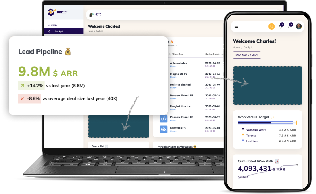
Embedded visualization covers data tools that offer real-time visualizations through embedded analytics. Embedded analytics is the simplest way to integrate analytics into your platform. With embedded analytics, you can quickly connect reports for customers directly into your application by copying and pasting the dedicated embedded code.
Embedded analytics can be embedded into applications and existing business software to integrate data from different sources and enable data-driven decisions. Data visualization is a core part of these applications, allowing users to comprehend and visualize the necessary information.
An example of embedded data visualization can be found in many e-commerce websites. These platforms provide customers with instant insights when they log in to their account, such as information about their purchase history trends, shipping and delivery statuses, and shopping cart analyses to see the distribution of items by categories and price ranges. This information helps the customer make informed purchasing decisions, engaging them throughout the entire customer journey.
Designing User-Friendly and Visually Appealing Dashboards
Data visualization must be user-friendly and appealing so users can easily access the data and information they want to make data-driven decisions. The more user-friendly your design, the better people will view your brand and the more enjoyable the customer experience becomes.
Some simple dos and don’ts of creating visually appealing dashboards with data visualizations include:
- Do know how to use pie charts. Pie charts aren’t the best option to show data with more than two points and should be reserved for instances like response rates of Yes or No to a specific question. Use bar charts to compare data with more than 3 points – it’s much easier to read and comprehend.
- Don’t use 3D visualizations. Creating 3D charts is incredibly time-consuming and often results in charts that aren’t readable or understandable to the average customer. The goal of data visualization is to present data in an easy-to-digest way, not to be flashy.
- Do keep things simple. Data visualization should tell one story per graph. These visualizations are best when they focus on the essentials rather than shoving all data into a single graph.
- Don’t color your shapes. Data visualizations packed with colors representing different data points are more confusing than anything else and make sharing information more complex. Avoid coloring your shapes and provide concise answers to your audience.
- Do remember that pretty doesn’t mean clear. No matter how stunning your graph looks or what color scheme you choose, just because something looks good doesn’t mean it reads well. Always focus on delivering a concise message and leave extravagant designs for another time.
Visual Storytelling With Data Visualization
One of the best advantages of data visualization is that it enables you to tell compelling visual stories. Data storytelling is a way to transform your quantitative data into a compelling story to better engage your audience and encourage them to take action. Data storytelling goes further than traditional data visualization to make information more accessible to users who don’t understand their data. It harnesses the power of clear communication, facilitating data accessibility, and is built off the idea that when data scientists can’t clearly communicate information, their data has little to no impact, resulting in value loss for organizations.
Simply put, the power of visual storytelling cannot be underestimated, meaning it’s essential that your organization knows how to craft compelling narratives using data. Here’s how you can do it:
- Understand your audience. Your narrative needs to be tailored to your core customer base, so do your due diligence and know what your audience wants in their stories.
- Know how to make people care. No matter how important your story is, you won’t have an impact on customers if you can’t make them care about your narrative. Add a human element to your story and include characters with specific goals that resonate with your audience.
- Prove your point. You need to back up your narrative with data points to prove your claims and engage users with your story. Provide data that shows the power of your proposed solution.
- Show your audience what you mean. Use data visualization to your advantage and incorporate visuals and graphs whenever possible, remembering that most users are visual learners.
Data Visualization Tools and Platforms
Choosing the right data visualization tools will play a role in your success. When choosing the best tool for your organization, consider the following:
- Easily embedded analytics. Choose tools that provide seamless integration capabilities that match your organizational needs.
- Light data preparation tools. Choose a platform with data preparation features for processes like data transformation, cleansing, enrichment, and more to streamline your processes.
- Data storytelling capabilities. The power of telling a story with your data cannot be overstated. Choose a solution that allows interactive dashboards, letting you add context to your visualizations.
- SaaS vs. on-premise. Know what your organization needs and choose a platform that meets these needs – for instance, determine whether you need software-as-a-service or on-premises solutions.
- Pricing models. Know your budget and scalability requirements when evaluating different tools for their pricing models, and choose a service that aligns with your plans.
- Ease of use. You don’t want your tools to be too complicated to understand, so ensure the platform is user-friendly for employees and customers.
Measuring Your Data Visualization Success
Knowing your key performance indicators (KPIs) allows you to measure the success of your data visualization solution, guaranteeing that your efforts are effective. Consider the following KPIs to understand your success:
- Active users: Monitor the users actively interacting with your visualizations to understand customer engagement.
- Feature adoption: Determine the number of users adopting and using different data visualization features to understand the features that resonate most with your audience.
- User retention: Look for high retention rates and measure the number of users continuously engaging with your visualizations.
- Conversion rates: Data visualizations are often integrated into your sales and marketing funnels, so tracking conversion rates is crucial to determine the impact visualizations have on customer actions.
- Customer feedback and ratings: Always collect feedback directly from your audience to determine whether they’re satisfied with your visualizations. Consider both quantitative and qualitative feedback and ratings.
Understand Your Data With Toucan
Navigating data visualization and engaging your customers is crucial to your success. Toucan provides analytics solutions to harness the power of data visualization and embedded analytics and take your organization to the next level.
See Toucan in action by requesting a demo today.


