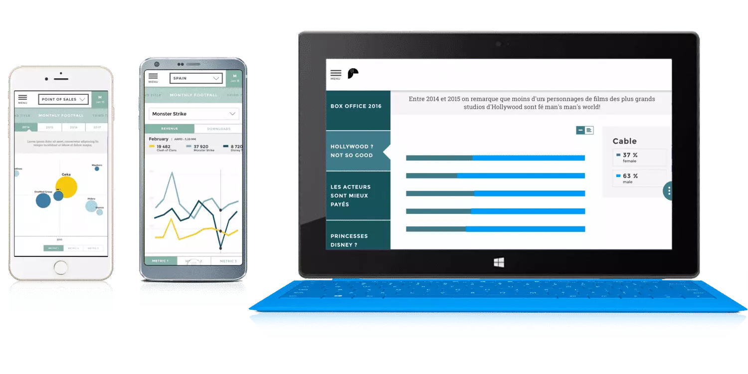
Data storytelling is the logical aftermath of several realizations made in the Business Intelligence area. The first one is about data visualization, also known as dataviz. For industrial needs, presenting data in a linear fashion as it is done in an Excel sheet, is often limited. This is why data visualization becomes more and more mainstream. Indeed it can convert data into interactive charts that make data visualization easier and help for a better and quicker understanding while allowing a simpler knowledge transmission.
This practice is common in data journalism where the audience is the general public. What is the next step? Adapting this practice to business users within the company. Using charts in addition to the complete data journalism and journalism methods, a new area of Business Intelligence is created: data storytelling.
Once upon a time there were some data…
During the Middle Ages, street theaters used to complete the church’s teachings of the illiterate people through tales. Storytelling helps break down complex concepts into simple images that are better at passing key information. Tales use this logic and enable the transmission of moral values through stories. Children can easily take social reflexes as such as ‘do not tell lies’.
According to Jennifer Aaker, a social psychologist and professor of Marketing at Stanford, stories are remembered up to 22 times more than facts alone. Thus telling the story of the performance of a department makes sense. Storytelling makes understanding easier the KPI and helps their transmission to the whole audience.
With data storytelling, less is more
Data storytelling is not just adding up charts and indicators. It is a smart mix: between ancestral information and knowledge transmission method and the most abstract and most serious by-product of modernity, meaning company performance metrics. Data storytelling implies using the latter and turning it into stories. Instead of building dashboards and adding up charts, we build scenarii. In place of focusing on indicators and raw data structure, our main concern is our audience’s expectation.
Though using the same data (as a starting point) you won’t tell the same story to raise awareness among managers about the social assessment of the company than you would to those in charge of human resources who run the monitoring of the payroll.
The best way of finding operational excellence is by telling your story depending on the action you want your targeted audience to do. A raw figure is hard to explain whereas a good story creates an impact.
The story created is impacting if you give some context: public data (INSEE: The National Institute of Statistics and Economic Studies in France) or market studies. Consequently, automated entity comparisons, Business Units, territories, products, competitors or clients are of course the main part of the impact created by the stories. But that is not all: the clarity of the information shown is key for you to order your priorities.
Data storytelling helps you order your information
Would you rather read a whole encyclopedia or a good novel? Using storytelling doesn’t mean that we give data back to the user saying ‘handle it yourself’. It is quite the opposite. We meticulously sort and choose the data we want to present. The user is thankful for that. Data analysts have time, training and prerogative to explore and exploit a database. Newbie users don’t have what it takes to do such things (and don’t want to either). Every time a data exploitation tool is made for a business user enabling them to “explore 100% of the database”, their needs are not taken into account. Because of laziness, disappointment or lack of skill, the effort to hierarchize isn’t done.
Would you ever bring a dictionary with you on your summer holiday if you are not an expert yourself? Of course not. Would you rather bring a well-written novel? Yes, you would. Using the same words, the writer would have chosen a way of putting the information whereas the encyclopedist lets the user do the sorting. This is the image for total access to a database VS a storytelling app. The difference between the two is the work that has been done sorting the information and structuring it.
- The Dictionary Effect, exhaustive and impenetrable would be Dataviz
- The Novel Effect, simple and hierarchized would be Data Storytelling
Rational and emotion-based decision-making
The decision-making process isn’t only rational. Neuro-scientists proved that decisions are made by the prefrontal cortex that manages emotions. To convey a message, one needs to address a person’s emotions. How? By telling a story. Storytelling calls on imagination and emotions. Advertisement in the consumer goods sector, for instance, uses it to create an emotional connection. The product isn’t the main focus but the story and the experience are.
Using stories in your company presentation will help stir your audience’s emotions, making it easier to convince them to make a decision or to take action. Indeed people are more responsive to stories than facts. Unfortunately, most company meetings miss the point by focusing solely on factual information. Data storytelling uses the language of stories to get the best impact possible out of facts during company meetings.
If you would rather share a good novel to your coworkers than a dictionary. If you get that you need to convince and talk them into taking action using emotions: data storytelling is made just for you.


