We often like to think that everyone working on a product understands how it is used and why new features are being developed. But are your product and tech teams really aligned on their work and understanding of your roadmap? The reality is, there’s often a disconnect between product and engineering teams. Your tech team might understand your product better than anyone, but there’s a good chance that they don’t understand your product lifecycle and your customer’s needs.
Why is that important? Well, if you want your tech team to develop the best solutions to the problems that they are solving, then they first need to understand the problems themselves. Product and tech team alignment is essential if you want to develop and provide the best possible product. This disconnect is often caused by a lack of communication or an inability to share meaningful data and information in the right way.
This problem can be solved throughdata analytics, data storytelling, and providing a platform that can serve as a single source of truth for data and analytics. Good data storytelling allows each audience and team member to be presented with information in the most suitable and easily understandable format and this can radically change their understanding of your product lifecycle and roadmap.
So, let’s take a closer look at how you can get your product and tech teams more closely aligned by providing them with the right key performance indicators (KPIs) and access to the analytics that they need.
-1.png?width=828&height=483&name=Blog%20Graphics%20(2)-1.png)
Improving understanding through data storytelling
The first step towards improving product and tech team alignment is understanding why they might not process the same information in the same way. People with different roles, technical backgrounds, and levels of understanding can interpret the same information in vastly different ways. Sometimes this is because their lack of technical knowledge or contextual awareness simply prevents them from properly understanding the information, but often it is because they approach the information itself from a different angle.
This is particularly important from a product development perspective, where engineers can often overlook why they are working on a certain feature and instead simply focus on what they’re building and how to build it. Why is that an issue? Well, if you don’t know exactly why you’re building something, then there’s a good chance that you end up delivering an imperfect solution.
That’s why good data storytelling can help each of your teams to fully understand all of the analytics that are being presented to them. It is the process through which data analytics are turned into a clear narrative and adapted to the needs of the intended audience. Making analytics more easily understandable for an audience, either in written or visual form, significantly increases their ability to both process and remember the information.
A study performed by Stanford professor Chip Heath showed that 63% of an audience could remember a story after a presentation, but only 5% could remember a single statistic. This problem is compounded when you fail to adapt the data and analytics that you are sharing to the audience that is receiving it.
Your tech and product teams will use different analytics on a daily basis and understand them in a different way. By adopting a data storytelling approach, you can ensure that they have access to the right information in the format that is most suitable for them.
This could mean allowing your tech team to better understand your product by turning spreadsheets into charts that more clearly show user interactions with specific features. Or allowing your product team to keep better track of development projects by clearly presenting timelines and progress charts.
This might all sound great in principle, but how do you actually go about implementing data storytelling and providing your teams with access to all of your analytics through a single platform?
Improve product and tech team alignment with the Toucan dashboard
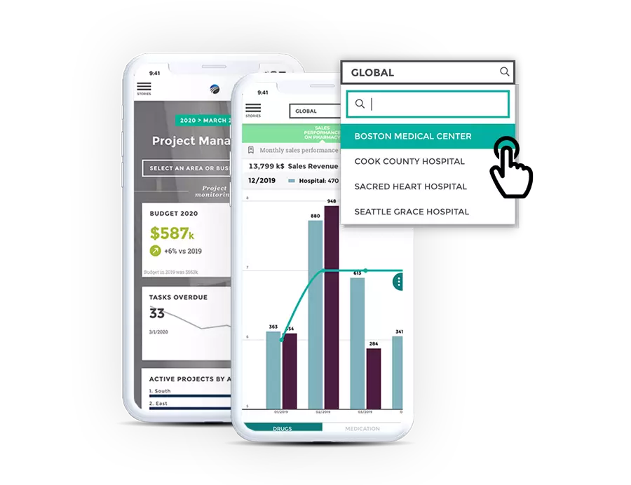
As with many problems that an organization faces, the answer is in finding the right tool for the job. To allow for the easy sharing of advanced analytics in multiple formats you need a dashboard capable of turning your data into actionable insights. The Toucan dashboard is built to integrate with all of your third-party data sources and encourage collaboration and data storytelling from a single platform.
This means that both your product and tech teams can have access to all of the same data and analytics, but can view it in the format that they can best understand. Developers are always big advocates for the single source of truth approach as it can great reduce the possibility of errors within a piece of software, and this also the case when it comes to analytics.
Storing information on multiple platforms, often in static formats like spreadsheets, increases the risk that not everyone has access to the same information or, potentially worse, have access to outdated versions of the information that they need. The Toucan dashboard solves this problem by allowing you to connect to the data sources that you need and use the platform to view all of your data and analytics in a single space. You can ensure that every user has full access to what they need and can see the latest information in real-time.
The Toucan dashboard also makes it easy to turn complex data and analytics into narratives and visuals that are more easily understandable for all of your users. Cross-team KPIs also increase collaboration and improve each team’s understanding of what others are working on and why.
So if you have read this article and could relate to any of the paint points that came up, it’s probably time to take a closer look at how the Toucan dashboard could help you to improve collaboration and information sharing.
Get in touch to schedule a demo and find out more.


