


What a terrible mistake !!!!!!!!
Pie Charts are one of the worst charts in the world. Or at least the most misused… They are so terrible that in the more than 30 charts available in our product, they are simply not there.
Why Pie Charts are bad ?
Let me explain…
Pie Charts go by two or by… none
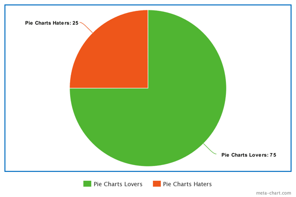
This is a great example of how to use a Pie Chart.
People make charts to make it easier to understand data. So the main goal of doing a chart is to make it easy for people to read.
Here it is quite simple. I know in a split second that the Pie charts Haters represent a fourth of the total. Pie Charts are great in a binary world. But the world, and data, are not binary.
What happens if I have 5 different labels ? Say no to Pie Charts
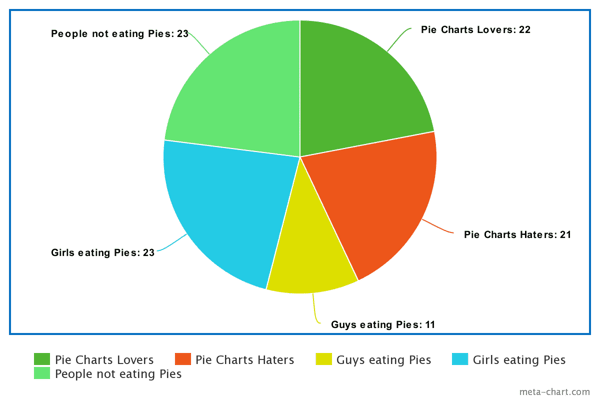
Now can you tell me what is the biggest slice in a split second ?
Exactly… You can’t ! Or you are more clever than you thought and your brain works really fast.
Now let’s try something else. Like a simple Bar chart.
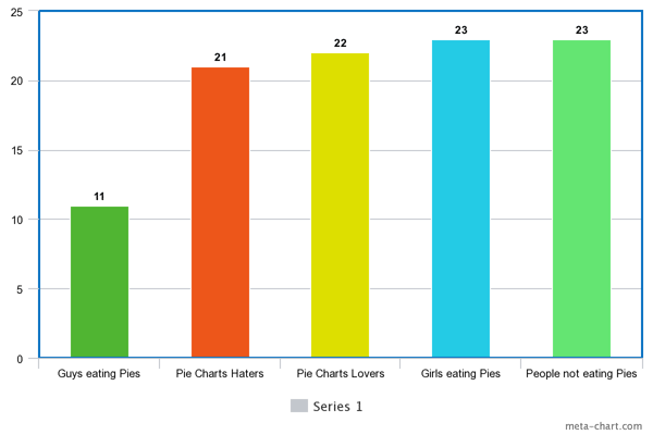
Well this is a looooooot better. Now you know exactly what’s going on.
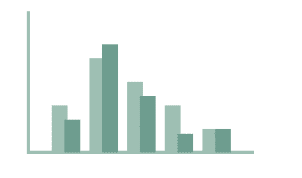
Pie Charts are made of angles. Our brain is not very good with them.
How can this phenomenon be explained? Here is a ranking of what your brain will understand the best when looking at a lot of data.
Source: "The Future of Data Visualization” – Jeffrey Heer : Link
But how to visualize data in my company without a Pie Chart ?
Great question !
Here are two of the best practices that should help you through most of your presentation!
If you are curious, we wrote extensively on this subject: Reporting : How to choose the right graph for your data
Our clients always focus on ROI, whether it’s marketing, finance, sales or HR department. What matters to them is to understand and monitor performance, and that is normal.
1) You either track your performance against competitors or between products
2) Or track performances over time
What I recommend is to use two types of charts:
1) Horizontal barcharts
Horizontal bar charts are really great for comparing performances, making tops & flops, and understanding spendings. When you have many factors to compare: products, companies, departments, people… this is the best illustration.
2) Line Charts
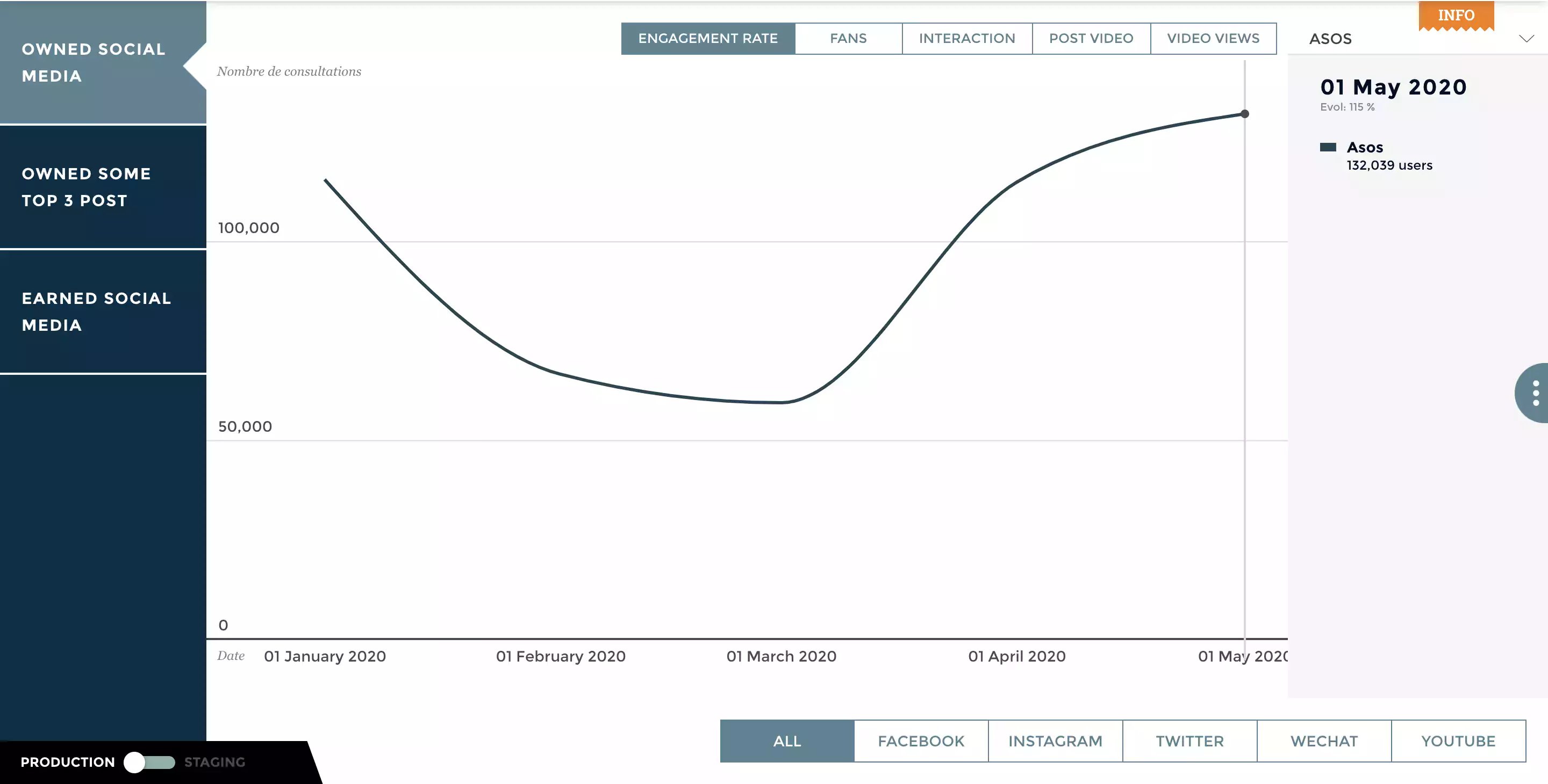
They are used to display a quantitative value over a continuous duration. When there are trends and interconnections. Line graphs also help to provide a global vision of a given interval, to assess its growth over a certain period of time.
When using a line chart, it is advisable to limit the chart to 3 to 4 lines, to keep the reading simple and easy.
Now go for it, and if you feel like exploring more, remember this article.
