


Dataviz is an art and a way to get actionable insights from your data by visualizing them. It empowers you to take vital decisions for your company’s growth, especially in the current context. After completing more than 300 data projects, we created and tested the best viz’s to answer the needs of different industries. Here are our tips and best practices for saving your time to help you know what is important to do and not to do.
First, it’s important to define more precisely what is a data visualization. Indeed, It consists of communicating figures or raw information by transforming them into visual objects: points, bars, curves, maps, etc. By combining simple functionalities and aesthetics, it offers significant time savings in data search & analysis. Please notice that all of the dataviz’s chosen to illustrate your data can be seen in an interactive Dashboard with a great UX design, and be used as to be a powerful data communication tool.
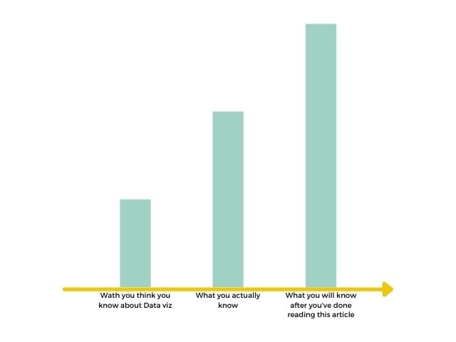
Check our data visualization guide
Here are the 5 dos & don’ts to get the best out of a DataViz
1 – DON’T COLOR SHAPES 🎨
When we look at the viz above, you can tell how people tend to love putting a lot of colors everywhere: blue, red, green. As a result, some dataviz’s tend to finally be similar to a rainbow and it gets quite confusing instead of being clear. Instead of being effective, the UX design makes shared information quite complicated to understand, and several questions come to mind.
What does the pink part represent? Last month’s sales? Annual growth?
It’s difficult to say …
Which % represents the pink part? The answer to this question is 33%.
No really obvious, is it?
So be sure to give access to clear, simple information and provide answers to your audience, by not coloring shapes.
To avoid this kind of error? Look at your graph and ask yourself (as if you were someone else of course or grab a friend 😉) what is the viz’ speaking about?
Please hide the number you want to represent to have a more honest and spontaneous answer.
If the answer is not crystal clear, choose again the right viz related to the data you want to value and associate it with a relevant name. Remember, your dashboard needs to be understandable at a glance.
2 – How to use Pie Chart
By looking in the viz above, you can see the pie is divided into more than 80 sections (yeah I counted!).
And I am sure everyone is wondering “What can I learn from this complex pie chart?”
Answer? Nothing!
You are right, normally the design is meant to simplify the reading and help you to understand what your huge amount of data is trying to say. But when the reading of a DataViz itself becomes complex, the role of the viz is no longer fulfilled and another one must be used.
So, instead of wasting your time trying to extract information or insights from it, remember these 3 tips:
- Pie charts can easily be replaced by bar charts that speak for themselves. They are more readable and the comparison of data is more instinctive in your dashboard.
- If pie charts are your only option be sure to have 2 or 3 sections maximum and use contrasting colors to show the difference between sections.
- The pie chart can be used to compare 2 data, for example, response rate Yes / No to a question.
3 – Don’t use 3D
Do you know how much time it takes to create a 3D chart like the one in the video?
The answer is more than 45 minutes (Yes I counted again) !!! That’s insanely time-consuming, and for what result?
- A cool, but not essential animation
- A cool, but not readable chart
- A cool, but not an optimal design
So our goal to extract precious information from data in a simple way: “data visualization” is not attained and worse, you waste your time creating a useless and complicated viz.
So remember this advice: 3D is good for video games and movies, but not for dataviz’s, right?
Prefer the utilization of a flat bar chart that is clearly more readable, efficient than this. It achieved further the design UX goal for a useful Dashboard.
4 – One Graph = One Story
When you create a dashboard and use dataviz, they are made to be quickly and simply understood by the less technical people in the company. As a result, simplicity is the keyword here so, 1 graph = 1️ story. Got it?
Indeed, adding too much data to your chart makes it less readable and more difficult to understand!
So here are the tips to follow:
- Go to the essentials. You must stage a single story for each of your graphics.
- Don’t try to compile all of your activity data on a single graph.
But how can you make it clearer and have one network at a time to observe this evolution?
Or various (like two or three maximum) in order to make comparisons?
The solution stands in a word: filters! Please play with it in the application below to check how it shows concretely,
Here, below, an example of Data storytelling, that compiles all the best practices we mention in this article :
5 – Pretty is not readable
Time to analyze the design of a graphic! First, the chart seems to have a beautiful curve
but you have 4 types of information that make it quite hard to read:
- different bar lengths
- 7 colors
- 2 numerical scales
- one additional metric
I agree, the graphic has a nice pastel color but unfortunately, it doesn’t make it more understandable and efficient.
So you must go back to what was your goal at first and what story do you want to tell and ask yourself the question: “Is the message well delivered?”.
If the answer is “yes”, this is exciting!
If the answer is “no” → keep asking it until you get a readable graph and you will certainly have to separate your data into several graphs (see tips 4).
Conclusion: cool-looking graphic doesn’t mean it’s easy-to-understand
CONCLUSION
You’ve enjoyed these tips and you are craving for more, please check out what one of our co-founders, an expert in data visualization, had to say in the video below
Hope you liked the content and feel free to give your feedback or ask for information by clicking the link below, we are always happy to respond.
