


BI Fabric: how to rationalize your BI tools while doubling adoption
Toucan Toco
Publié le 17.08.20
Mis à jour le 13.01.26
8 min

Executive Summary
Although the promise of BI Fabric tools is attractive as it is, Data Leaders should be aware of the principal problem of why there are so many BI tools in an organization to begin with: a lack of differentiation amongst BI platforms. Data Leaders should use BI Fabric tools that also incorporate a component of Data Communication – or the explicit association of design and data storytelling to deliver clear and relevant insights (rather than explore data) to an untrained audience – to not only rationalize their BI tools but also reap longer-term benefits.
Findings:
- The presence of numerous BI tools in an organization can be explained by undifferentiated offerings, a weak positioning, a lack of focus on who the customer is, and a shared result of low adoption amongst untrained business users.
- For longer-term rationalization and adoption results, Data Leaders should look toward BI Fabric vendors that better their data communication strategy by drastically improving the customer-facing User Experience.
- Simplifying the way data is communicated will impact adoption rates, rationalization, consolidation and ultimately, value.
Weak Positioning in BI
When BI became mainstream amongst data analysts, the messaging of the platforms evolved to address a significantly larger market segment: untrained business users. The platforms’ products, however, did not evolve in that direction. If you were to put a modern BI tool in the hands of a non-technical user, they would likely not know where to start from, they’d be overwhelmed with the sheer amount of choice, and would need to find the time to get trained and guided to deploy dashboards that would serve them well.
The need to gain data literacy skills in order to use these platforms is a strong sign that these products are still too complex, and it’s also a major obstacle to the wide adoption of analytics. And even if untrained users were only served ready-to-be-consumed dashboards, the user experience is still far from the flawless, easy, intuitive, guided user experience they’re used to from the apps they use on a regular basis to manage their private lives.
For example, mobility in BI is still a matter of discussion and needs deployment consideration and time. Also, the loading time of visualizations often takes 10 seconds because of the large volumes of data ingested; thereafter degrading the user experience and leading to abandonment rates of BI tools.
It is also not uncommon to hear about customers limiting their large-scale-deployment dashboards to 3 to 4 KPIs for their business users in order to limit complexity. However, if attaining a data culture at scale is the customer’s goal, their workforce will need to be comfortable looking at more metrics to be better informed, independently of their data literacy level and without the issue of complexity taking place.
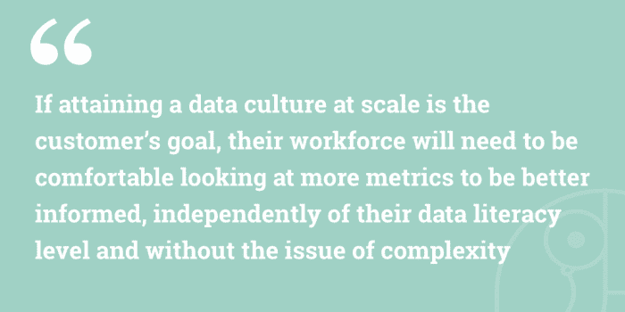
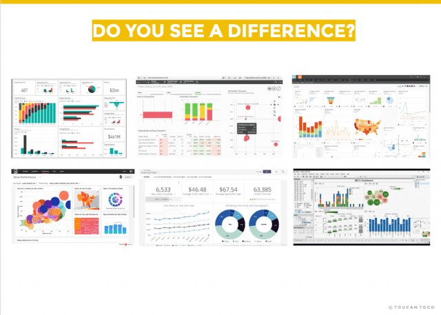
Figure 1: Building a dashboard may have been facilitated for data experts, but the resulting customer-facing product has maintained the same complexity
That is to say that the push for aggressive growth of both Modern and Traditional BI tools without adapting their products or creating new ones with a more adapted front-end user experience to address the needs of this larger, new type of untrained audience has led to a halt in the adoption of analytics at 32% (Gartner).
The market talks about Augmented Analytics and the automated delivery of insights through Natural Language Generation/Processing. However, a picture is worth a thousand words, this is why NLG (Text & Voice) will not replace the delivery of insights on a graphical visual format. If the graphical delivery of insights as we know it today and call “dashboards” is not working for business users, it is surprising that vendors haven’t revised the visual delivery of information already. Vendors also know how much progress and work is required to get a flawless AI and human/machine interaction for NLP/G to work. Hence, if BI solutions are not being widely adopted effortlessly, why haven’t vendors reviewed the way data has been delivered graphically in these last decades?
“Augmented analytics”* is the use of enabling technologies such as machine learning and AI to assist with data preparation, insight generation, and insight explanation to augment how people explore and analyze data in analytics and BI platforms.

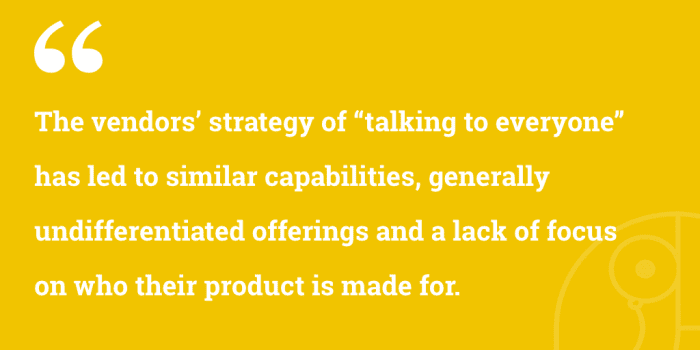
BI vendors have been on a constant quest to answer every need, tick every box in an RFP and do the necessary to get into the infamous magic square to win deals. This has pushed vendors to deploy new capabilities, front- and back-end, every month or quarter, to satisfy everyone, rather than a specific segment in the market. Today the only question you’ll ever need to ask is “does your tool do” to which you’ll get an instant “Yes”. The vendors’ strategy of “talking to everyone” has led to similar capabilities, generally undifferentiated offerings, and a lack of focus on who their product is made for.
Because these tools were made with data analysts in mind, they’re highly adopted amongst them which explains why they’re so many passionate communities built around these vendors, but these products also share the result of low adoption amongst untrained business users. Today no particular BI tool stands out in a compelling and significant way as being for untrained business users.
Of course, we’re many to hear about how an organization was able to win its bet against change management and put analytics in the hands of everyone. When I worked in sales, I would sometimes face a team that would showcase a lot of pride telling me about their award-winning BI project. And they should be proud, after all the investment in time, effort, experts, resources workshops, and professional services they invested in the tool.
But this is exactly the problem.
Analytics for untrained business users is considered a technology-agnostic mission, since all vendors generally do the same thing, notably when it comes to the front end experience. So aside from prospects wanting the latest capabilities, wanting to AI-everything, and having a long list of “can you” questions, if being a do-everything solution is seen as the more attractive offering, why should vendors make the effort of adopting a different positioning or deliver information in a drastically different way?. Furthermore, speculation related to vendors opening up their ecosystem to other vendors has been circulating, however, we do not think it will happen because of the vendors’ wish to maintain a homogenous environment for their users, and ultimately, higher revenue.
In short, the proposal of BI Fabric vendors to centralize BI tools, decommission unused licenses, and offer an easier access to users is compelling and creates value. However, they must also further address the outdated methods of graphical data delivery by offering an enhanced User Experience to untrained end users. Despite BI Fabric vendors highlighting an enhanced UX, progress is still required:
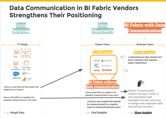
Figure 2: Despite rationalizing BI tools, BI Fabric Dashboards still need to be further simplified to be adopted
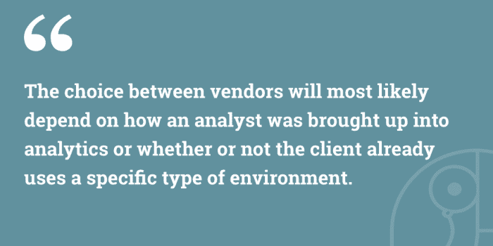
To summarize, today’s BI tools are not that different from an untrained business user’s point of view. By wanting to do everything, BI vendors failed to gain a strong positioning, meaning that the choice between vendors will most likely depend on how an analyst was brought up into analytics or whether or not the client already uses a specific type of environment.
This is different from choosing a platform based on how well it delivers value to untrained business users. The weakness of positioning, the desire to be do-everything products, and the lack of consistent results amongst untrained business users that helps them stand out in a compelling way is one of the strongest reasons why there are so many BI tools in a single company. No analytics platform stands out as being made for untrained business users, and untrained business users only.
focus on Data Communication and increase your business intelligence adoption
The complexity and user-unfriendliness of the user experience in BI tools is a common feedback: dashboards don’t deliver a clear message, seeing several KPIs at the same time is overwhelming, and the user experience needs greater simplicity.
Not all business users plan on exploring their own data on a regular basis, and a significant part only requires access to the everyday metrics they need to know of to perform well.
A typical usage would be a daily check up, lasting a few minutes, to understand what actions should be taken in the day. Should they have questions requiring a more in depth analysis, they would rather ask a specialized resource to look into it.
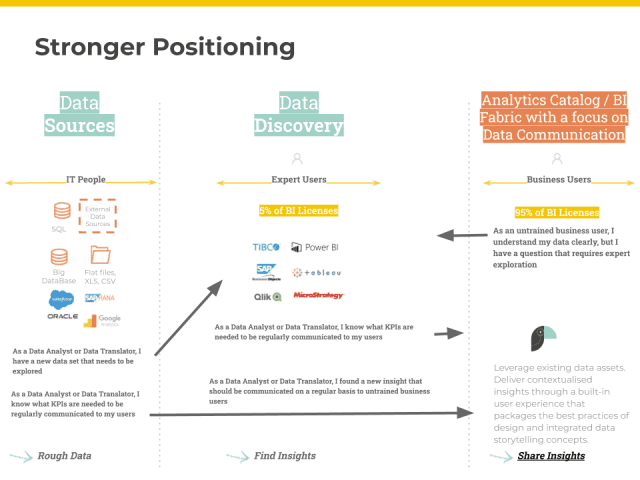
Figure 3: A stronger positioning.
By focusing solely on the communication aspect of data to untrained business users, strong design and technological choices can be made in a product from the very beginning. Similarly to popular consumer sites such as wix.com and squarespace.com – which offer business owners the ability to set up their own pixel-perfect website by leveraging a built-in UX without the need to code or design – a BI Fabric Vendor that integrates an aspect of Data Communication in their product would also integrate a built-in User Experience that packages the best practices of Design and Data Storytelling for the sake of expert-free, fast deployment and high adoption.
Storytelling is a relatively new variant of delivering data visually. It involves adding context to insights in order to deliver a clear message to wide audiences. However, this capability has not entered the everyday life of business users yet and it is used on exceptional occasions; when a discovery in the data’s been made and an analyst wishes to present a Show-then-Throw PowerPoint-like presentation to their audience.
In a nutshell:
- By taking the contextualization aspect of storytelling and integrating it in a built-in narrative environment, data communication allows the industrialization and standardization of a new way of delivering information with graphics, thereafter replacing clumsy dashboards with a more user-friendly experience for business users.
- By building-in a guided framework, data translators are also able to benefit from a stronger tool positioning by deploying faster thanks to built-in design best practices: for example, pie charts should not be allowed in a communication context since such a chart type does not communicate a message clearly. Similarly, more than 2 KPIs should not be allowed on a single screen, because it’s been measured as being overwhelming for untrained users.
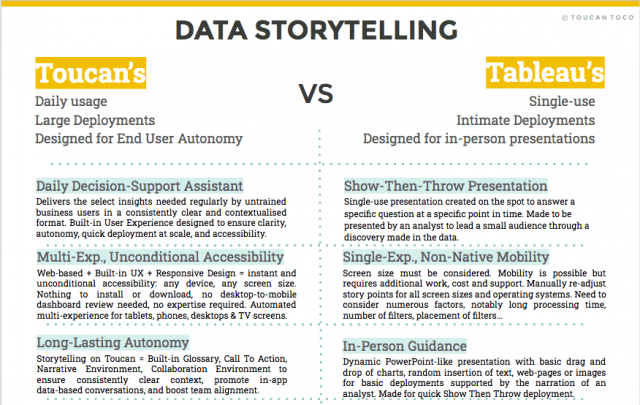
Figure 4: Industrialized Storytelling vs Show-Then-Throw Storytelling
The built-in environment used to communicate data is positioned differently than the unlimited flexibility provided by BI vendors. As previously mentioned, Modern BI tools were built to allow the exploration of unknown datasets to find insights.
To use a data communication platform, it must be acknowledged that it will be used to communicate validated and regularly needed metrics to a large audience asking for simplicity, guidance, and autonomy, whilst data experts are liberated of the manual tasks of designing a user-friendly dashboard, now taken care of by the platform.
To summarize, BI Fabric vendors can offer more value to their customers by providing a data communication aspect in their product – designed to be clear and simple.
The decision to incorporate a built-in narrative experience, a contextualized environment, a built-in collaboration environment and select charts in a dynamic and interoperable platform helps replace the everyday complex dashboards with a more modern and fluid tool that maximizes existing data investments, does not overlap with existing platforms, and delivers clear insights graphically at scale with no training required for end users.
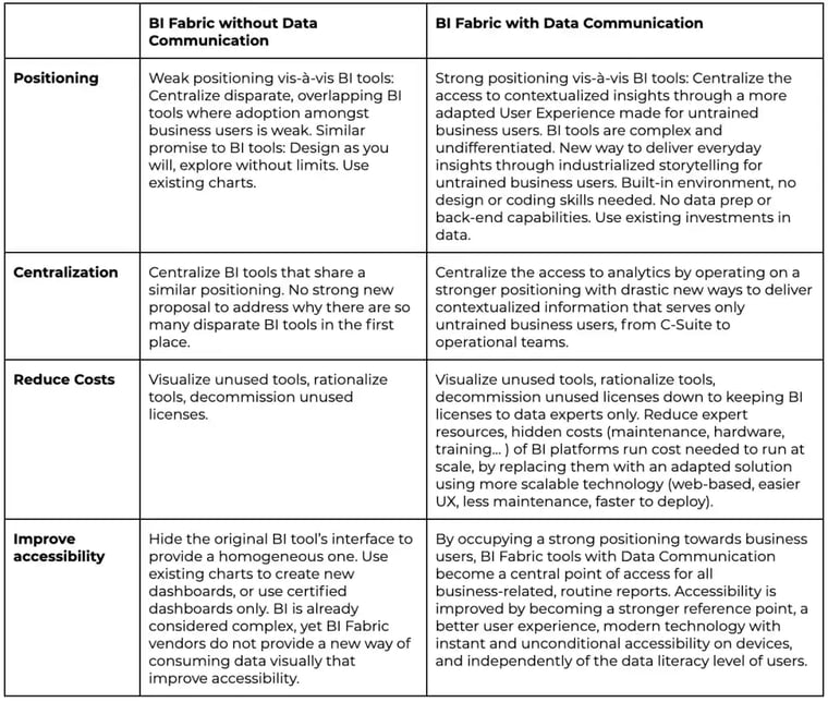
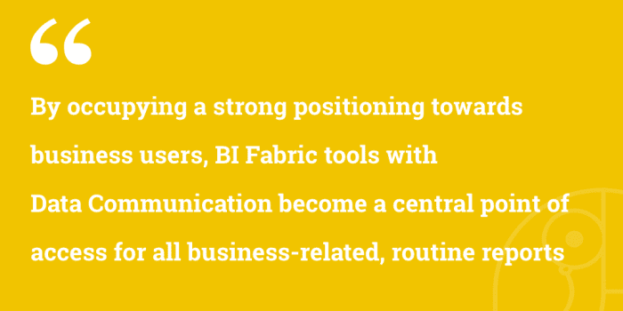
By choosing to focus on business users, BI Fabric vendors become a reference point for all customer-facing analytics without replacing exploration tools, but by simply rationalizing BI tools and the licenses to only data experts; improving governance, centralization, cost reduction, ROI, and adoption.
They will be able to position themselves as the platform for untrained business users and fix the underlying issue behind why there are so many BI tools in a single company. So it’s a win-win situation.
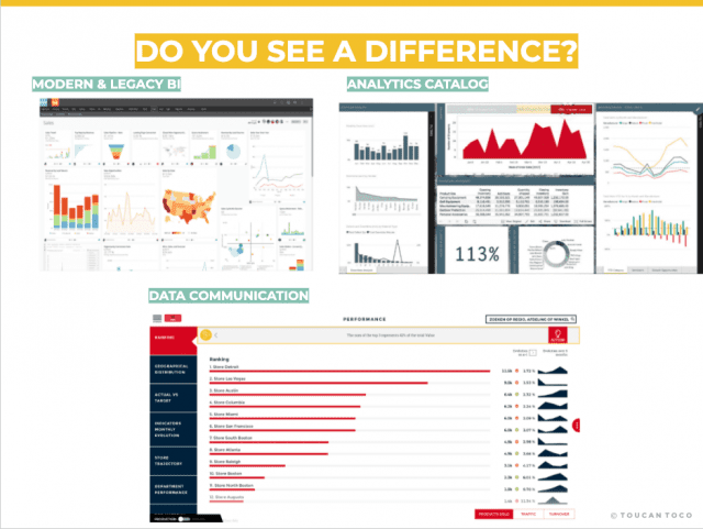
Figure 5: BI Fabric with Data Communication offers a clearer user experience for business users
Business intelligence adoption: The advantages of BI Fabric vendors who focus on data communication
BI Fabric tools address the need to consolidate a group of tools that are unused. However, they fail to provide a drastic new way of consuming analytics for the untrained business user through a more guided, clearer format than traditional dashboards.
The issue with untrained users is not only a lack of accessibility only, but a lack of team alignment due to numerous tools, consistent comprehension, and clear user experience. And although BI Fabric vendors may market a new and easier UX, there is still room for progress.
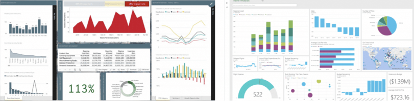
Figure 6: Theia vs Power BI: the difference is not compelling.
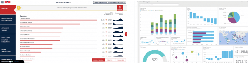
Figure 7: Toucan vs Power BI: Clear simplification
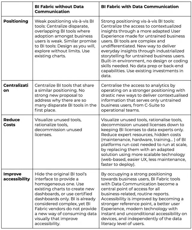
Figure 8: BI Fabric vendors focusing on Exploration or Communication
Conclusion
BI Fabric vendors offer a compelling and valuable offering to AD&D professionals looking to better manage the portfolio of BI tools, and provide their business users with easier access to analytics.
However, by not revisiting the way data has been communicated for years towards untrained users, the value delivered by BI Fabric vendors will limit itself to a short term financial ROI related to cost optimization, decommission of unused licenses, and rationalization of tools. By adding a data communication component to their platform with standardized practices, BI Fabric can occupy an even stronger positioning and deliver bigger value by easing the deployment and adoption of more user-friendly analytics.
