10 Design & Data Storytelling Best Practices for Untrained Users

Toucan Toco
Publié le 05.08.20
Mis à jour le 13.01.26
6 min
Résumer cet article avec :

One of the most explicit technological choices made to support this goal in a data communication tool is the built-in User Experience that packages the best practices of design, UX, and aspects of data storytelling for dashboards that ensure consistent clarity for untrained users. Some of these built-in choices include a library of built-in charts, a single font, a limit of 2 KPIs per screen, and a contextualized environment. But what exactly lies behind these design choices, how does it explain the doubling, sometimes tripling of the adoption rates within Fortune 500 companies that have already invested in numerous BI tools?
In this article, we’ll cover the top 10 best practices that we incorporated in Toucan that make a real difference in the daily life of our 100+ Fortune 500 customers.
1 – No Pie Chart 🙅🏻♀️
Although one of the most popular charts in the world, the pie chart stinks! Easy adoption means easy and fast comprehension. For example, which color occupies the largest chunk?
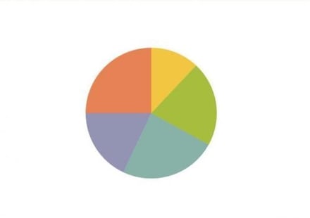
If you’ve spent more than a second thinking about it, it’s already a waste of time. Pie charts can be effective when limited to 2 portions, but if you’re trying to compare more than 2 elements, you should move away and replace it with a Bar Chart.
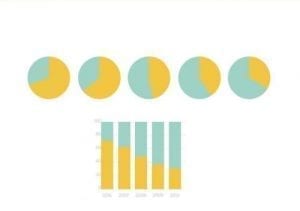
Much clearer, right?
2 – 3D is for video games only. 🎮
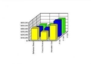
Can you see the exact size of the blue rectangle? Its value? Me neither!
Adding a dimension to your graphs doesn’t necessarily mean it is more sophisticated. There are numerous use cases where a Data Analyst created fully custom charts with numbers, colors, and dimensions flying all over the place, but their internal clients had a hard time understanding the data. Always choose clarity over sophistication, it will take you a long way.
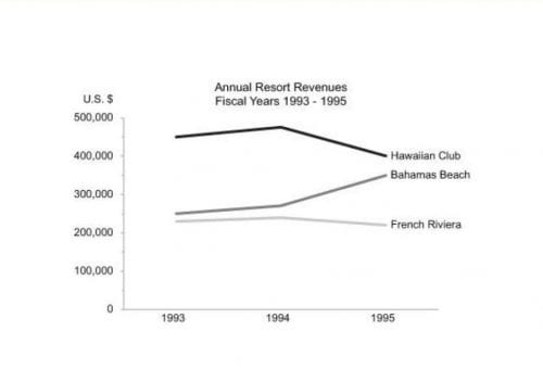
Here’s the same data represented in a 2D format.
Check our guide to Data visualization
3. – Pretty doesn’t mean Clear 👌
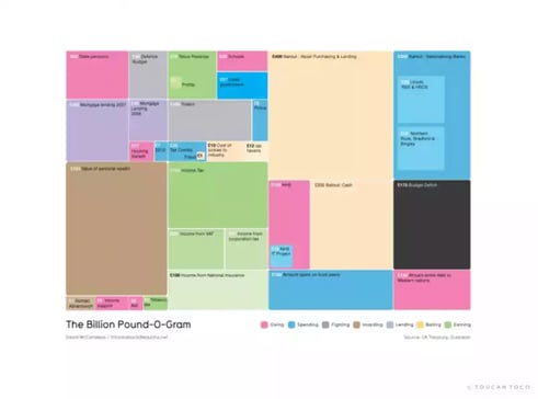
Wow, lots of colors and lots of information! But is the message clear enough that you understand what the data analyst is trying to tell you?
Let’s play a bit!
So, between the “Bailout: Asset Purchasing & Lending” section or the “Value of Personal Wealth”, which one is larger? There are numbers attached to it… Ah, now you get it!
But if you try to get the bottom of it, you’re asking a lot of unnecessary effort from your brain.
So please 🙏 simplify as much as possible and leave the highly customized graph for a highly trained audience.
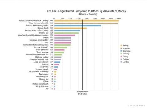
Ah, that’s a bit more straight to the point!
4. No more than 2 KPIs per screen. 🖥
What you see at every point in time in a Toucan Toco app is limited to a maximum of 2 dynamic graphs. Here’s an example:
But, wait a second. I want my users to have all the information at once. Otherwise, they might blame me for not pointing it out to them!
Dashboards as we all know them are the main cause behind low adoption rates.

Can you see the difference between this graph and the previous one?
Presenting numerous KPIs at once, no matter their order is difficult to digest for the eyes and is extremely complex to comprehend quickly by an untrained user.
It’s also very complicated to turn a desktop dashboard to a mobile one, since a revision of how the graphics are consumed and if the UX is still working, is necessary.
By keeping things simple and limited to 1 message per screen, a data analyst or interpreter is much more likely to deliver a clear and actionable message to their audience without overwhelming them or creating Cognitive Overload.
There are numerous workshops on how to design efficient dashboards that have been on the market for years, yet the whole industry is brought to a halt in adoption because that’s just not what business users need. Seeing several KPIs at once is necessary for exploration, but communication is a whole different discipline.
In short, keep it simple and structured.
5. Stop wasting time on Fonts. 📝
Adapting the font of your dashboard to your corporate branding, or having a personal preference to what looks best, is a terrible waste of time because it doesn’t take into consideration how it affects the adaptability of a dashboard. Here’s an example using MonoSpace font. Can you tell me in just a second how many orders of magnitudes there are? Go!
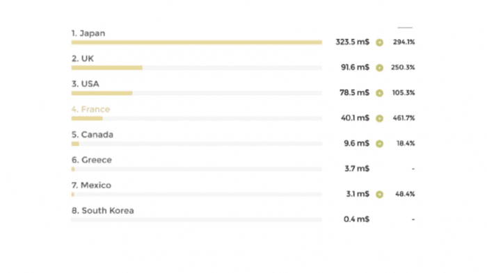
The resulting issue is that the numbers are not properly aligned. The design should help the user understand the order magnitude of a number quickly, before even reading the actual value of the number, simply through alignment. The MonoSpace font means that every character occupies a different amount of space. By choosing the Table Font, often present in Developer Software to code, we ensure numbers are always aligned, making the delivery of a message quick and easy to understand.

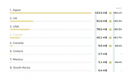
For an untrained user who has no time to waste, it’s about delivering a message as quickly and efficiently as possible. This level of detail goes often way beyond what a data analyst may think of as being necessary.
6 – Add Context 📕
Business users want to be autonomous on having more context or explanation of what a graph means, or what is the context within which the data is presented. And they’re right because annoying thousand times the data analyst is quite annoying.
Plus, by including a contextualized environment surrounding graphs, data analysts or interpreters ensure the scalability of their work via precisely the autonomy of their users.
Adding context consistently ensures that your message is clearly delivered no matter the data literacy level of your users, therefore contributing to the boost in adoption. Yay!
Here are some examples of context:
In dashboards, the context is best placed on top of a graph, in order to centralize all the action buttons on the top of the page.
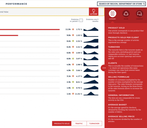
7. Ensure Team Alignment with a Glossary. 📖
When working with enterprise-sized businesses, it’s likely that a use case includes team members located in different parts of the world, with one of them having a different background, and therefore a different understanding of what KPIs mean or how it is calculated.
It has also been measured that almost 60% of a meeting’s time is invested in explaining what numbers mean, leaving only 30% of the meeting to the discussion of facts, and less than 10% to taking a decision. By aligning a team from the very beginning, a good data communicator is able to help a team invest 60% of their meeting time in discussing their decision, thereafter improving the quality of the choices made and impacting the bottom line of the business.
Adding a glossary to your dashboards within an easy reach will affect how your team works. We found that it was such a good practice that we’ve incorporated it in Toucan Toco’s UX Design:
8. Corporate Branding 🤵
Prefer a friendly and familiar environment because it increases the adoption rate. Users will adapt faster to a familiar space and will be put more at ease to navigate it.
Many BI Vendors offer this capability, that’s true, but few teach you to start with it directly.
Adding a background and a logo should be your first steps when creating a new application, followed by the selection of your brand’s color. Here’s an example of McDonald’s corporate branding without their colors, and then with their colors. From a user’s perspective, this looks like a homemade app made for them.
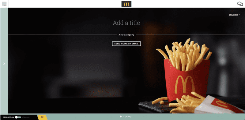
Without the right branding
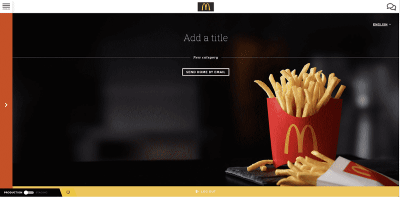
With the right branding, it’s better right?
You’ve got it! Tips number 8 is about Making Feel Like Home.
9- to ensure easy adoption: Guide your users in their next steps. 🧭
Telling someone something without telling them is not really effective and doesn’t ease the interaction.
By incorporating a Call to Action* on the data you delivered, users are more likely to act directly on some guided next steps and come back on the app to see how their decision affected the bottom line. It’s kind of rewarding in a way
Of course, certain decisions take more time to reap their fruit, but by guiding your users in moving into action, you’ve already won!
In Toucan Toco’s application, every story has a clear CTA*, which also adapts to who the user is, and what action they should take depending on their data.


Here’s what this should look like, with the button consistently placed in the top right corner.
10- Stay Consistent and don’t be afraid to stand your ground. 🧐
We often stumble on use cases where the customers wanted to communicate data with the practices of data exploration, notably the presentation of numerous KPIs on a single screen.
Sometimes, these customers are able to deliver their message by keeping their dashboards limited to 4 or 5 KPIs, keeping in mind the fear of over-complexifying the dashboard if they were to add more of them. This comes unfortunately as a detriment to the expansion of a data culture given that users need to have access to more information to make more precise decisions in our ever-complex world, with numerous factors affecting the outcome of a decision.
This consistency has worked for them but should be applied on a larger scale.
Consistently choosing 1 font, 1 structure, 1 place for your buttons or filters also means that as a data analyst, BI Manager, or data interpreter, you’re able to deploy up to 3 times as fast as having to rethink your design every time.
At Toucan Toco, we’ve built our UX based on analytics that supports what works and what doesn’t, and we’re now putting it in the hands of corporations who’ve invested enormous amounts of money in BI tools, trying to convert these data exploration tools into communication tools. Yes, a Design First Approach is when the design is deduced from precise studies but also from continuous adjustments, always keeping in mind what works best and allows for quicker comprehension.
In a world filled with complexity, many of them understood that simplicity might be what customers truly need. Then the adoption rate will follow.
Feel free to share this article with anyone, comment, give us feedback, and ask for more information, we will be glad to answer them all. 😉`

Toucan Toco
Voir tous les articles

