Data Storytelling is the process of communicating relevant insights in a way that can be understood by a wide audience. Your customers can make informed strategic decisions by combining narratives and visualizations.
-2.png?width=1050&height=613&name=Blog%20Graphics%20(4)-2.png)
Our natural affinity for plotlines and narratives that convey information lies at the core of the power of data storytelling. In order to simplify complex information, it is necessary to use the right tools in order to arrange quantitative metrics or information in a logical order, and then present it in a way that engages your customer.
It is evident that data storytelling is powerful. We examine several data storytelling techniques and best practices, backed by actionable advice, to help you get started with telling stories with data that your customers can understand. Let's take a closer look at them.
1) Make metrics actionable
You can turn metrics into actionable concepts or insights when you know how to tell a story with data.
The use of key performance indicators (KPIs) is one of the most effective ways of turning quantitative data into results-driven narratives. Your data will come alive with the help of an interactive embedded analytics dashboard built to engage customers, like the dashboards at Toucan. These dashboards let you select KPIs that align with your core organizational goals.
Discover the value of data-driven dashboards by reading our article on creating a data-driven experience in your product.
2) Develop a narrative
A solid story has a definitive plot, regardless of its theme or format: a beginning, a middle, and an end. When you use data storytelling tools and platforms, like Toucan, you can create visuals that will drive the narrative forward and effectively convey your message to your customers. Similar to a typical movie or book, your data stories should begin with a description of the current situation, follow with insight leading to a conflict, and conclude with data-driven decisions for the next step.
Whenever you are plotting a data-driven story, it is advisable to sit down in a collaborative environment and outline the beginning, middle, and end of the story. After you have established a framework, you should begin to populate it with the KPIs and visualizations that not only represent the message your customers need, but are also most relevant to the data you wish to present. If you work through your plot logically and add the appropriate visuals to make it more compelling, you will be able to streamline processes and engage your customers, thereby increasing efficiency and productivity. Next, we will examine the visualization component.
3) Identify your sources of data
Despite it being one of the shortest points discussed in this post, it is one of the most important ones. You must now gather the data that will enable you to convey your narrative to effectively engage your customers. Once you have gathered the data it is time to connect it with your analytics. though this might sound like a technical step, it doesn't have to be. Toucan comes equipped with a 1-click connection to over 100 data sources, which means anyone can now connect data sources. This is a prerequisite for the success of analytical data storytelling. Prioritize only the data that is useful to your analysis in this case. It is important not to overwhelm your customers with information. The best way to reduce cognitive load is to carefully select the variables you will use and keep only the most critical data.
The cognitive load concept is based on the idea that the brain is limited in its ability to perform multiple tasks at once, so we should be careful about what we ask it to do. As a result, maintaining a focused data set makes total sense. A study found that the human brain cannot focus on more than 7 things at a time, so we recommend keeping the number of KPIs on a single dashboard to below 7.
4) Pick the right visualizations
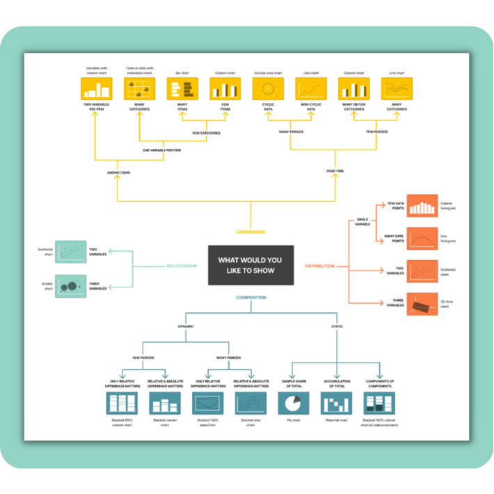
In order to produce a successful data story, the third and final component is visuals. When a narrative has been constructed and the data sources and KPIs selected, it is time to choose the graphic representations that will help tell this story.
It is possible to create a variety of visuals such as bar charts, line charts, tables, and pie charts, just to name a few. The idea of utilizing all of them may sound exciting, however, you should take care when deciding how and when to use them. It is important to keep in mind that not every visual will be suitable for every situation. Keeping on the right path requires following specific data visualization techniques. As an example, using a pie chart to compare more than three elements can result in an overwhelmingly crowded visual and become difficult to understand. It is much better to use a bar chart to illustrate how the various elements compare to one another. Find out the best situation to use every type of chart in our data charting article.
In addition, it is important to keep visuals simple. You should avoid using any 3D graphics that can make your data difficult to understand for your customers. Adding dimension to your charts may appear sophisticated, but it can also have a significant impact on how they are perceived by your customers and lower the engagement rate. Therefore, simplicity should always be a priority. Furthermore, maintaining a consistent color palette throughout the presentation will make it more cohesive and easier to understand.
5) Remove any clutter
Keeping your story focused is another important best practice. Imagine that you are creating a presentation. Your audience does not want to be overwhelmed by a large amount of text or numbers. The same principle applies to both a centralized view of information such as dashboards as well as to a more detailed view of a specific graph.
One of the advantages of dashboards is that they are a great way to create a narrative around your KPIs. On the other hand, filling them with too many indicators may result in confusion. Avoid including any unnecessary elements and only include those that will actually contribute to your story. To ensure you are on the right track, you can also follow dashboard design best practices.
Alternatively, if charts and graphs are not constructed correctly, they can be cluttered. Prioritize only the datasets that are necessary to support your argument. For instance, when displaying the top ten products by revenue, do not add additional metrics like revenue per salesperson or revenue compared to investment. If you still wish to include these metrics the best way to do it is with filters. Toucan offers the ability to use multiple filters so that you can filter revenue by timeframe, salesperson and investment giving your customers multiple views of the same data.
6) Keep it simple and make connections
As your customers grow, evolve, and boost profits over time, they will become well-informed, data-driven and strategically oriented.
By tapping into the power of data storytelling, your customers will be able to simplify ideas and make connections that will give your business and theirs a fresh sense of direction.
You should create an interactive dialogue between insights and your customers in order to maximize the benefit of data storytelling efforts, whether it is for financial reporting or company strategic development. To accomplish this, a combination of historical and real-time data should be used.
Additionally, it is important to ensure that the words you use and the visuals you present are aligned in order to provide your customers with the context needed to make data-driven business decisions.It is most effective to use data storytelling with visualization as a method of creating data-driven narratives that simplify insights. Our next step will be to explore the application of this invaluable concept.
7) Use the right tools for data analysis
While it might appear that the data storytelling techniques and best practices we just discussed are aimed at technical customers, that could not be further from the truth. Using the right tools will allow you to accomplish that. Today, there is a wide range of online data visualization tools that are built for customer-facing analytics and provide users with the necessary context to generate actionable insights with their data without the need for any technical skills.
Toucan, for example, offers a dashboard tool with multiple charting options that allow you to create an efficient narrative based on your most important KPIs. If you are not technical, do not worry as Toucan is a 0-code platform where anyone can build their analytics within 10 minutes. By having access to these types of tools, you can make the process of data storytelling much more accessible to your customers. This allows them to use data to assist in making decisions regardless of their level of technical knowledge. In time, your entire customer base will become data-driven and gain a big competitive advantage.
Dashboard Storytelling Examples
To illustrate the points we’ve made so far, we’re sharing a few dashboard presentation examples of storytelling opportunities created in Toucan that will help you further understand how data storytelling will enable your customers to engage more.
- Single Metric Performance Over Time
- Progress Towards Goals
- Multi-Parameter Comparisons
Single Metric Performance Over Time
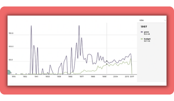
The Single Metric Performance over Time chart allows you to create a narrative around the progress of a chosen metric. From this chart, you can easily evaluate your efforts over a specific time period and determine whether they’ve given the desired results.
Progress Towards Goals
If you need to track the efficiency of your strategy, whether it’s marketing or sales, and present your performance in front of your managers, the Progress Towards Goals dashboard is ideal. Here, you can track even short-term goals and make sure you’re on the right track every step of the way.
-3.png?width=710&height=415&name=Blog%20Graphics%20(1)-3.png)
Multi-Parameter Comparisons
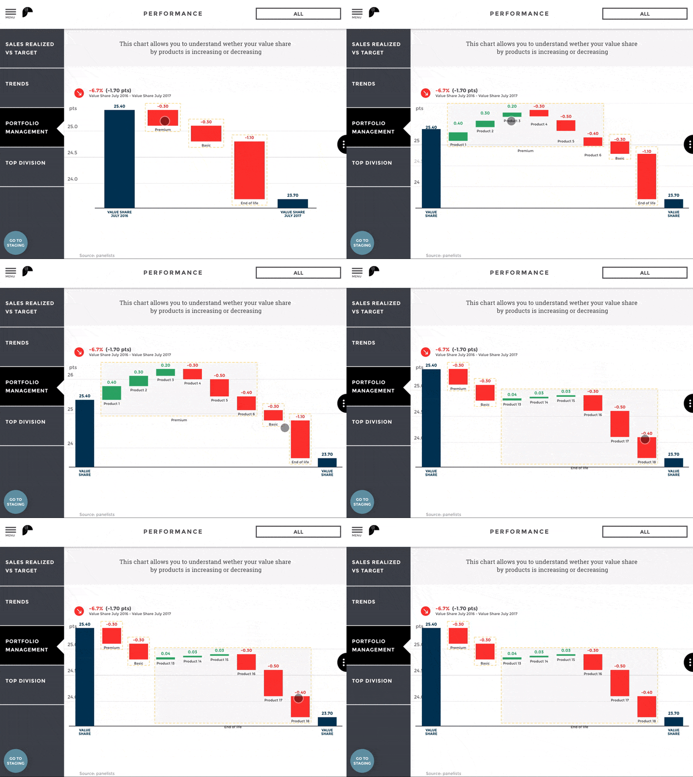
Drill-down reports are necessary when you need to understand why spikes or drops are occurring in your revenue and fix the problem. A Multi-Parameter Comparison chart is an excellent tool for analyzing multiple metrics that affect your overall performance at the same time.
Comprehensive Dashboard
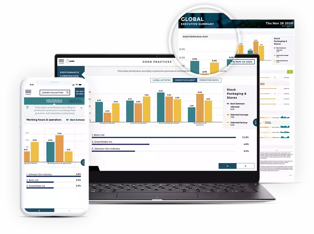
When your customers need a single view to understand the effectiveness of your solution, the best way to represent this narrative is with a comprehensive dashboard. It gives all the relevant information and KPIs in One glance. If customers want to get more information they have the ability to drill down and any tile of their choosing.
-2.png?width=710&height=415&name=Blog%20Graphics%20(2)-2.png)


